Tradeoff Analysis: The Web Application
Jonathan Katz
David R. Smith, US Geological Survey, Leetown Science Center
Mitchell Eaton, US Geological Survey, Southeast Climate Science Center
February 22, 2018
Introduction
Tradeoff analysis is the process of evaluating which of several potential courses of action offers the the best possible outcome, and in the process of this evaluation it can also offer insight into where deficiencies exist – or what must be done to increase the final return. Tradeoff analysis is typically performed before any action is taken, and it therefore depends on predictions of how a given action will affect one or more objectives. Accurate predictions are therefore a foundation of quantitative decision analysis, and among the goals of tradeoff analysis is to base a decision on the best information available. In some cases, quantitative models can predict consequences with known accuracy. In cases where models have not been developed predictions may be generated through expert elicitation. For complex decisions with many objectives, it is likely that models will exist for some objectives but not others, and expert opinion will be used where modeled effects are unavailable.
Tradeoff analysis can be framed as a multiple-criteria decision analysis (MCDA); to do so, it is first necessary to list all realistic courses of action, or alternatives. The MCDA process also requires us to list in advance all relevant objectives that should be satisfied to some extent by all actions. To evaluate the effect of each alternative on each objective, two attributes of each objective are outlined a priori: a method for quantifying (measuring) the effect of that each action on each objective, and the preferred outcome for each objective (minimize vs maximize measurements). To facilitate comparison of evaluations of each objective it is normal to map the measurement scales between objectives to a common scale, often a 0 to 1 scale in which 1 represents the most desirable outcome. It is also common to incorporate a weighting scheme that allows different stakeholders to emphasize the objectives they perceive as most important and marginalize those viewed as less important. The outcome can then be evaluated under multiple weighting schemes to explore the extent to which each stakeholder may be satisfied by which alternatives.
This goal of this application is to facilitate tradeoff analyses by performing the comparative scoring automatically and present the results in a flexible and informative manner. Although this is just a fraction of the work that goes into a proper tradeoff analysis it may be one of the more cognitively difficult components due to the need to track outcomes for numerous objectives, alternatives, and weighting schemes.
Users of the app will need to use a spreadsheet program to outline alternatives, list all relevant objectives, and identify how each objective will be measured and what measurements will represent success before opening the app. Here we describe how to format these files as inputs to the app, how to manipulate the subjective settings within the app, and how use the output to interpret the results.
We use as a case study a decision in the project to return natural tidal flow to the 1,100 acre Herring River estuary in the towns of Wellfleet and Truro, Massachusetts (Figure 1). The Herring River estuary has been isolated from the natural tides from Wellfleet Harbor since 1908 by several dams and dikes placed to expand agricultural land and provide a substrate for local roads. Wellfleet Harbor is a state designated Area of Critical Environmental Concern due to high nutrient inputs from adjacent watersheds, of which the Herring River estuary has the largest area. After decades of hydrologic and ecological research the Cape Cod National Seashore and Herring River Restoration Committee proposed to restore tidal exchange and natural communities to the ecologically degraded system by installing flow control gates in dikes and converting dams with roads over them to bridges. The decision remaining to be made is the rate at which flow will be restored. The alternative options include multiple gate opening policies that are designed to delay the time until full gate opening. The various policies yield different tidal flow restriction, and each policy has the potential for unique ramifications on each of the multiple stakeholders.
Stakeholders identified include aquaculture and shellfish farmers in the harbor as well as landowners within and adjacent to the estuary. Landowners include many private residences, a golf course, and several local businesses. Partnerships have been established between the towns of Wellfleet and Truro, the Massachussets Department of Fish and Game, the National Park Service, the United States Geological Survey, and the United States Fish and Wildlife Service to develop a plan and initiate action. To date, a decision framework has been agreed upon that helps decision makers and stakeholders characterize risk tolerances and community values and formally evaluate trade-offs among competing objectives (e.g. restoring hydrography and ecological function while avoiding adverse impacts and minimizing cost). The outcomes of different management strategies will be predicted by a combination of numerical ecological models and expert knowledge where needed. The decision-making process is far from complete, so the information provided here is presented only for example and is not intended to be an accurate representation of the project.
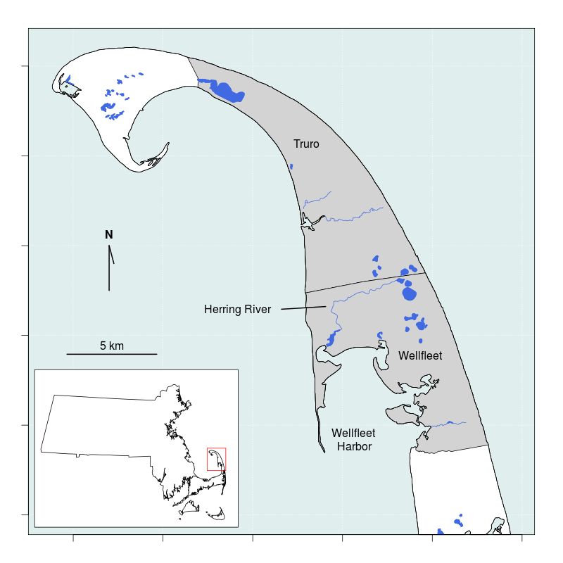
Figure 1. The Herring River estuary occupies portions of the towns of Wellfleet and Truro on Cape Cod, Massachussets and flows into Wellfleet Harbor.
This example introduces several elements that are specific to the project and are not generally part of MCDA evaluations. First, the alternative actions of this project consist of gate policies, which are sequences of flow control gate settings over multiple years. For this reason the term alternatives is replaced by the term policies when describing the app. Second, this project is adaptively managed but the initial policy decision is not intended to be evaluated after one year. Instead, when choosing the initial policy to enact the effects are predicted to 25 years from the present, and the policies are evaluated after effects accumulate for those 25 years. Although this application was created specifically for the Herring River Tidal Restoration Project, we expect that it could be adapted for other projects with minimal effort.
User Interface
Overview
The app consists of a website with numerous tabbed displays. There may be infinite ways to work through the tabs from start to finish, so we will focus on the most efficient paths. At a minimum you must upload the policy and attribute tables and at least one prediction table and then view the prediction sources before moving to the outputs. A more considered approach includes reviewing the utility preferences (in Options > Adjust Utilities), setting or reviewing the weights (in Options > Weight Objectives). A handful of possible routes through the app are diagrammed in Figure 2 below.
Figure 2. Direct and considered pathways through the application user interface.
Distribution Format
The app is distributed as a Windows executable. Once installed, the app opens in the computer’s default web browser. The app was developed in Firefox (version 58.0.1) but has passed testing in Internet Explorer (version XXX) and Safari (version XXX). The server that does all dynamic UI generation, data manipulation, analysis, and plot generation runs R portable (version 3.4.2) through the Shiny package (version 1.0.5). The user interface consists of a navigation menu embedded in a collapsible sidebar on the left, and a main page body containing interactive forms, tables, and plots. The sidebar and forms are designed to be viewed on screen size of 1366x768 or higher; smaller screens and mobile devices may clip content without warning. On smaller screens it may be possible to adjust the browser zoom level to see all content (typically “Control -” to zoom out and “Control Shift +” to zoom in).
Privacy
The app operates by parsing tables uploaded by the user, manipulating and merging their contents, and presenting the results in tabular and graphical formats. User content must therefore be made available to the app using the on-screen widgets, however, because the app is run through an assigned localhost server the file contents never leave the user’s computer and there is no chance they may be intercepted between the web forms and the localhost server. No data are stored on the localhost server beyond the session duration and no information about the user, the user’s web browser, or the user’s operating system are collected by the app or transmitted beyond the user’s computer. When the user closes the browser all traces of the session are removed and can not be retrieved.
There is an option for the user to download a snapshot of their session as a .RDS file and restore the session in the future by uploading the file. RDS files are data-serialization files for the R computer language and these files may be opened and their contents inspected in R, although it is recommended that if users open this file they do not save changes as doing so may corrupt the ability to faithfully restore the analysis at a later date. The RDS file contains all data uploaded by the user and if privacy is a concern access to these files should be controlled as if they were the original files.
Workflow
Figure 3 traces evaluation from uploaded parameter and prediction files (rectangles) to a cumulative utility value per policy and weighting scheme. The process begins when parameter and the prediction files are uploaded. Default column names of the attribute table are noted, and the arrows indicate the fate of each column’s contents. The structure of the policy table is much more flexible: the cumulative utility is informed by the contents of the table and also the column names and the row count; labels to the right of each arrow indicate the fate of each component.
After the parameter and the prediction files are uploaded there is one user-mediated process (circle) for which default values are not supplied: the prediction source selector. There are also five user-mediated processes for which default values are supplied: the group editor, the utility editor, the uncertainty editor, the value weighting editor, and the discount editor. Because it has no default value the prediction source selector must be viewed the app to advance. It is possible, although not recommended, to skip all other user-mediated processes and advance directly to the graphical or tabular output.
The group editor is used to collapse subobjectives under a single heading. This is useful with spatially implicit subobjectives, which may be collapsed under a single objective heading to more easily digest the resulting scores. The default behavior is to collapse all subobjectives under a single objective wherever possible. The utility editor allows the utility function for each subobjective to be parameterized within the app. The two parameters of the utility function include the risk attitude (e.g. “riskSeeking” vs “riskAdverse”) and goal (minimize vs maximize measured values). The default values for these parameters are set in the attribute table using the columns “Utility” and “Direction”.
There are five points at which the user may inspect values without altering the cumulative utility: the prediction and utility previews, the consequence table, the score and rank tables, and the plots. In the prediction preview the predictions for all subobjectives is displayed as a panel of line plots using the native measurement scale over time. In the utility preview the annual utility are displayed as a panel of line plots using the utility scale (0 to 1) over time.
There are a number of points at which values are transformed (ovals). First, expert elicited four-point predictions are converted to a statistical distribution on upload and all predictions are reshaped to a series of time x policy tables, interpolating as necessary to fill in temporal gaps. Then all predictions are converted to utilities, a process that maps the predicted value to a uniform scale based on default values for risk attitude and direction defined in the attribute table. The utilities are value weighted (default valuation is equal-weighting by objective), and lastly the weighted utilities are discounted (default discount factor is 1).
The final score is the time-aggregated weighted, discounted utility for each weighting scheme and policy combination.
Figure 3. Flowchart tracing evaluation from prediction and parameter upload to score/rank tables and plots.
Using The App
This application is parameterized via a series of tables uploaded as comma-separated values (csv) files. There are as many as four types of tables - not all are required for all analyses - and each is saved to a separate csv file. The table types include a single policy table, a single attribute table, any number of expert prediction tables, and any number of model prediction tables. The contents of each table should match the following examples as closely as possible, including adhering to case-sensitive column headings where indicated in Table 1.
| Type | Required | Expected Column Names |
|---|---|---|
| Policy | Yes | Column names refer to policies |
| Attribute | Yes | Obj.lbl, Objective, Model, Direction, Utility, Prediction†, Distr†, GlobalHigh†, GlobalLow† |
| Elicitation Predictions | No* | Objective, Low, High, MostLikely, Confidence, Policy, Time |
| Model Predictions (lookup) | No* | Must match subobjective names (see text) |
| Model Predictions (interpolated) | No* | Objective, Estimate, Confidence, Policy, Time |
†These columns only used when expert predictions are included.
*A minimum of one of these three prediction types must be supplied.
The Policy Table
Policies, or alternative actions being considered, specify the actions for one or more time periods into the future. In the Herring River Tidal Restoration Project the alternative policies consist of different flood gate settings set on the first day of the year. For most policies the gate settings remain static for the duration of the year, although see “Single vs Multiple-Vector Policies” for an exception. The gate settings are coded with two integers: the first is the number of gates open, the second is the height to which all gates are opened. For example, in Table 2 below, all five policies (columns) use the same gate setting the first year (row): one gate open to eight feet, coded 1_8. After the first year the policies differ in either the number of gates open, the height of the opening, or both number and height.
The table structure thus has distinct policies in columns and time in rows. For each policy and time, an action is coded into the table using any value of your choice. The column headings name the policies and should be free of spaces and special characters, but are otherwise unconstrained.
| P_5 | P_15 | P_25 | P_15SF | P_2GS | |
|---|---|---|---|---|---|
| 1 | 1_8 | 1_8 | 1_8 | 1_8 | 1_8 |
| 2 | 2_6 | 4_1 | 2_2 | 1_8 | 4_1 |
| 3 | 3_10 | 7_1 | 4_1 | 1_8 | 4_1 |
| 4 | 7_10 | 2_6 | 7_1 | 1_8 | 2_6 |
| 5 | 7_10 | 5_2 | 7_1 | 2_2 | 2_6 |
The specific action represented by each code value in the policy table can be recorded elsewhere in the project. Ideally the coded notation will be brief because for some predictions the app will take the order of gate configurations from the policy table and look up the predicted effect on the objectives in a prediction table. The number of rows in the table is important because it identifies the timeframe at which policies are compared. Although we will be able to inspect the utility value for each policy, objective, and year, for this project we are specifically interested in a final score representing the cumulative utility at the end of the decision timeframe.
Some decisions may not employ different actions each year, but might consist of a single action for which the consequences are evaluated. In these cases the policy table can be constructed with a single row, or time period, as in Table 3 below.
| P_5 | P_15 | P_25 | P_15SF | P_2GS | |
|---|---|---|---|---|---|
| 1 | 2_6 | 4_1 | 2_2 | 1_8 | 4_1 |
Upload the policy table by selecting “Upload Files” at the top of the sidebar at left, then selecting “Policies”. Then click the “Browse” button and select your policy file (Figure 4). The file name will appear on screen twice: once above the status bar and again below the uploader. The duplication is intentional; if you are restoring a saved analysis the uploader is not used, but the file name will still be reported below the uploader.
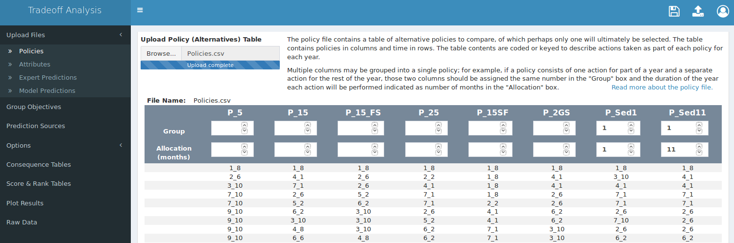
Figure 4. Screen capture of the policy uploading tab. The navigation bar is on the left, the uploader is at top-center, and the policy group/temporal allocation table is at the bottom. Blank groups (top row of boxes in table) are implicitly identified as single policy vectors.
Single vs. Multiple Policy Vectors
In the example policy tables (Tables 2 and 3), all policies are coded as “single policy vectors”, which means that each policy consists of a single action per year for one or more years. It is conceivable that a policy may be more complex than this — a policy may consist of multiple actions per year, which can be coded with multiple action codes for each year. Doing so can simplify the prediction process if the gate setting predictions already exist. The app can accomodate this with “multiple policy vectors”, which allow two or more columns in the policy table to specify one policy. For example, instead of opening a gate a fixed amount for the entire year, a gate may be opened halfway for one month and then set to wide-open for the remaining 11 months. In addition to joining multiple columns as a single policy we also need to identify the proportion of the time each action will be applied.
After a policy table is uploaded a table will appear on the page; at the top of the table we can indicate that a single policy will be the result of a combination of the last two columns by assigning them the same number in the “Group” fields, and we can also indicate the time allocated to each action in the “Allocation” fields (see Figure 5 above).
Typically the time allocation units are months of the year, so the sum of all allocations in a single group should be 12. In practice these values are marginalized before use, so these fields can take any values that adequately summarize the action.
The app will treat blank “Group” fields for single policy vectors as if they were assigned to unique groups. The settings in Figure 4 above are thus equivalent those in Figure 5 below.
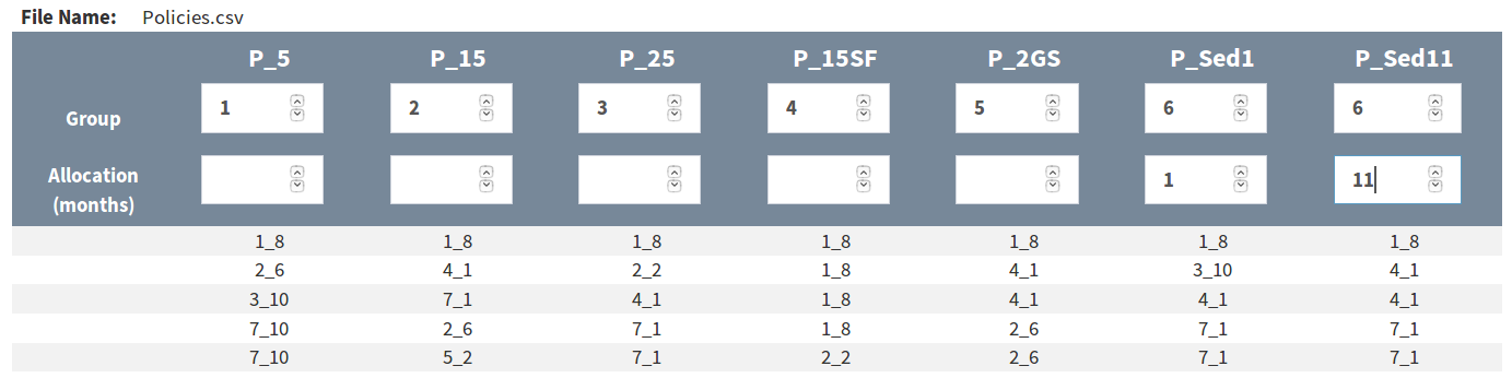
Figure 5. Alternate but functionally equivalent grouping to that in Figure 4, using unique integers to indicate single policy vectors rather than leaving the boxes blank.
The app currently requires at least one single policy vector and will accept not more than one multiple policy vector in the policy table.
The Attribute Table
In a multiple-criteria decision analysis objectives are often hierarchical. A fundamental objective may encompass multiple objectives, which in turn may encompass multiple subobjectives. One of the six fundamental objectives of the Herring River Tidal Restoration Project is to achieve a more natural hydrography. Hydrography is divided into seven objectives, three of which are tide range, marsh surface drainage, and marsh surface elevation. These three objectives are further divided into subobjectives and all risk evaluation, predictions, and measurement are done at this subobjective level. A subset of the hydrography objective hierarchy is diagrammed in Figure 6.
Figure 6. Subset from the objective hierarchy with hydrography - the fundamental objective - at left, a subset of objectives in the middle, and a subset of subobjectives on the right. The hierarchy chain to each subobjective is listed in a single cell of the attribute table, with a dot (.) delimiter between levels. Subobjectives may be grouped (boxes) by specifying the objective group name in a seperate column in the attribute table.
The attribute table is where we specify the hierarchy of objectives, along with additional attributes about the objective – hence the name.
To cut visual clutter when presenting scored objectives, the application can group objectives at two levels. The first is by organizing subobjectives under their parent objective and visually indicating which subobjectives are related. The second is by collapsing multiple subobjectives under a single pseudo-subjobjective and presenting only the pseudo-subobjective for display.
Organizing Subobjectives
In Table 4 the first column, “Obj.lbl”, contains the hierarchy of objectives from most general to most specifice. Each entry thus lists the fundamental objective, then the objective, and ends with the subobjective. The value in the first column and first row is “Hydrography.Hydroperiod.FloodingFreq”, which represents three levels of objective separated by a single period, which is the default delimiter. It is acceptable for levels of the objective label to contain spaces, but it is important that the most specific subobjectives be unique, and no level should contain periods since they will be interpreted as delimiters.
| Obj.lbl | Objective | Model | Prediction | Direction | Distr | Utility | GlobalLow | GlobalHigh |
|---|---|---|---|---|---|---|---|---|
| Hydrography.Hydroperiod. FloodingExtent | FloodingExtent | INTERP | Snap | Max | NULL | RiskAdverse | 0 | 86 |
| Hydrography.Hydroperiod. FloodingDuration | FloodingDuration | INTERP | Snap | Max | NULL | RiskAdverse | 0 | 3.44 |
| Hydrography.Marsh Surface Drainage.Ponding | Ponding | LOOKUP | Snap | Min | NULL | RiskAdverse | 2.8 | 28.7 |
| Ecological Function/Integrity.Area Restored.Salinity | Salinity | LOOKUP | Snap | Min | NULL | RiskAdverse | 0 | 1040 |
| Ecological Function/Integrity.Area Restored.Vegetation | Vegetation | LOOKUP | Snap | Max | beta | RiskAdverse | 0 | 100 |
| Ecological Function/Integrity.Surface WQ.pH | pH | INTERP | Snap | Min | NULL | Linear | 0 | 100 |
| Ecological Function/Integrity.Surface WQ.DO | DO | INTERP | Snap | Min | NULL | Linear | 0 | 100 |
| Adverse Impacts.Public Safety.RiskElsewhere | RiskElsewhere | INTERP | Snap | Min | NULL | RiskSeeking | 0 | 22 |
| Adverse Impacts.Harbor Shellfish Beds.Ammonium | Ammonium | Elicit | Snap | Min | beta | RiskSeeking | 0 | 100 |
| Adverse Impacts.Harbor Shellfish Beds.Fecal | Fecal | Elicit | Snap | Min | beta | RiskSeeking | 0 | 100 |
The second column of the above table, “Objective”, appears to duplicate the most specific subobjective level, but there are cases where the two will deviate. The “Objective” column values primarily indicate which subobjectives can be collapsed under a pseudo-subobjective. Unlike the most specific subobjective in the “Obj.lbl” column, the “Objective” column values do not need to be unique. By repeating an objective name in the “Objective” column across multiple rows of subobjectives we indicate that those subobjectives may be arbitrarily grouped and collapsed under a pseudo-subobjective. This is desirable for decisions that use the objective hierarchy to evaluate spatially implicit subobjectives.
Spatially Implicit Subobjectives
There will be decisions for which some objectives apply only to specific regions, rather than to the global decision area. For decisions involving land use the regions may be hydrologic subbasins, towns, or any other distinct geographical subset. For non-geographical decisions the terms “region” and “global” can be interpreted metaphorically.
In Table 5 the subobjectives “MLW”, “MHW”, “Ponding”, and “Deposition” are evaluated in two different hydrologic subbasins, but when we compare alternative policies we are not immediately interested in the how each policy scores in the specific subbasins – instead, we are more interested in how each policy scores for measurements across all subbasins. We do this by indicating the region in the most specific component of the objective hierarchy, but apply the same “Objective” column label to all output. The app will recognize the duplication and allow us to manually create arbitrary groups of pseudo-subobjectives that can be collapsed to summarize the score across all subbasins or expanded to inspect the scores in each specific subbasin.
| Obj.lbl | Objective | Model | Prediction | Direction | Distr | Utility | GlobalLow | GlobalHigh |
|---|---|---|---|---|---|---|---|---|
| Hydrography.Tide Range.MLW-LHR | MLW | LOOKUP | Snap | Min | NULL | RiskAdverse | -3.50 | -1.88 |
| Hydrography.Tide Range.MLW-UHR | MLW | LOOKUP | Snap | Min | NULL | RiskAdverse | -3.50 | -1.88 |
| Hydrography.Tide Range.MHW-LHR | MHW | LOOKUP | Snap | Max | NULL | RiskAdverse | -0.96 | 4.30 |
| Hydrography.Tide Range.MHW-UHR | MHW | LOOKUP | Snap | Max | NULL | RiskAdverse | -0.96 | 4.30 |
| Hydrography.Marsh Surface Drainage.Ponding-LHR | Ponding | LOOKUP | Snap | Min | NULL | RiskAdverse | 2.80 | 28.70 |
| Hydrography.Marsh Surface Drainage.Ponding-UHR | Ponding | LOOKUP | Snap | Min | NULL | RiskAdverse | 2.80 | 28.70 |
| Hydrography.Marsh Surface Elevation.Deposition-LHR | Deposition | Elicit | Delta | Max | lnorm | RiskAdverse | 0.00 | 2258.00 |
| Hydrography.Marsh Surface Elevation.Deposition-UHR | Deposition | Elicit | Delta | Max | lnorm | RiskAdverse | 0.00 | 2258.00 |
| Hydrography.Marsh Surface Elevation.Accretion | Accretion | Elicit | Delta | Max | norm | RiskAdverse | 0.00 | 2258.00 |
Related subobjectives will use individual utility function parameters and may use different model types (for modeled objectives), prediction types and distributions (for elicited objectives), and desired measurement directions and utility-risk characterizations.
Attribute Table Columns
The column names in Tables 5 and 6 are the column names which the app looks for when the attribute table file is uploaded.
| Column Name | Data | Details |
|---|---|---|
| Obj.lbl | Objective hierarchy | First element is most general objective, last is most specific subobjective. Last subobjective must be unique. Used for grouping objectives and subobjectives in output. |
| Objective | Objective name | Can duplicate. Used to label output and look up predictions. |
| Model | Prediction source | Use keyword “Elicit” for expert predictions, use any other keyword for modeled predictions. Match keyword in prediction file name. Used to find predictions for each objective. |
| Direction | Goal | Identifies whether we prefer the smallest measured values (Min) or the largest (Max). |
| Utility | Risk attitude | Five default risk attitudes are built-in: “ExtremeRiskAdverse”, “RiskAdverse”, “Linear”, “RiskSeeking”, and “ExtremeRiskSeeking”. |
| Prediction | Prediction type | Either “Snap”, “Delta”, or blank. Used to direct interpolation of expert predictions: “Snap” or blank will use the raw predictions, “Delta” will use the cumulative predictions. |
| Distr | Probability distribution | The distribution to which four-point elicitation values are converted. Must be a valid R distribution with a density function such as: “lnorm”, “norm”, “beta”, “pois”, or “NULL”. NULL will use the MostLikely value with no confidence estimate. |
| GlobalLow | Lower prediction boundary | Lower boundary for elicited prediction values, used to create appropriate lookup tables and for displaying range in plots. |
| GlobalHigh | Upper prediction boundary | Upper boundary for elicited prediction values, used to create appropriate lookup tables and for displaying range in plots. |
Optional Columns
Weighting Subbasins By Area
Default value weights are divided equally among fundamental objectives, then within each fundamental objective the objective weights are divided equally, and within each objective the subobjective weights are divided equally. This default behavior may not be best for all projects. For example, when subobjectives are spatially implicit it may be advantageous to specify a subobjective weight that is proportional to each subobjective-area. This is achieved by using a spreadsheet program to add a column to the attribute table that contains the proportional area for each subobjective (subbasins should sum to 1), then selecting that column as the Subbasin Proportion Column (Figure 7). Subobjectives that are intended to apply to the entire area (i.e. not spatial) should have their weight designated with weight for the full area, which is 1. For these values to be applied correctly the Subbasin Proportion Column must be selected before any Weight Columns are selected as value weights.
Value Weights
Value weights may also be included directly in the attribute table. To include weight columns use a spreadsheet program to add one or more columns to your table and populate the column with weights, then select those columns as Weight Columns (Figure 7). It is not necessary to normalize the weights on a 0-1 scale in each column, but be aware that weights in a column are valued relative to all others in the column. This contrasts with how the app presents weights. In the app weights are isolated and specified using a three-tier hierarchy: fundamental objective weights are presented on a 0-1 scale relative to other fundamental objectives, then objective weights are presented on a 0-1 scale relative to other objectives within the same fundamental objective, and finally subobjective weights are presented on a 0-1 scale relative to other subobjectives within the same objective. To value-weight a subobjective score, the product of the objective weight and the subobjective weight is marginalized by dividing by the sum of the weights, and the final weight is then applied to the score. Weights uploaded in the table are similarly marginalized, both for display and before being applied, and some rounding error may accumulate in the process. Weights included in the attribute table are presented in the value-weight editor and may be corrected or altered in the app if desired.
Optional weight columns can use any names that do not overlap with the default names, but spaces will be removed from the names during processing.
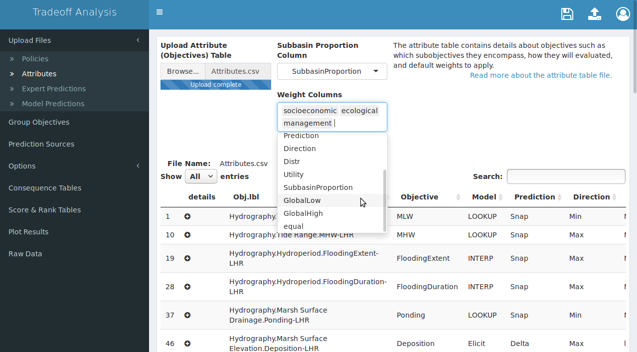
Figure 7. After the attribute table is uploaded, you may optionally select default subobjective weights (top selector: “Subbasin Proportion Column”) and/or indicate which column(s) contain weights (lower selector: “Weight Columns”). Subbasin proportions must be selected before weight columns to be applied correctly.
Expert Predictions
In the absence of quantitative models, predictions of future effects of current actions can be obtained through expert elicitation. This app accepts tables summarizing four-point elicitation methods for which experts predict a high value, a low value, a most likely value, and then quantify confidence in their prediction. The expert elicted prediction table contains each of those four values for each objective, policy, and time, listed long-form. Table 7 contains expert predictions for a single objective, “Accretion”, for six policies at years 1, 3, and 5. The elicitation process grows more laborious as the number of objectives, policies, and time points grow larger, so it is assumed the predictions will be for discrete times separated by intervals greater than one. The app will convert the predictions to the probability distribution specified in the attribute table (if not “NULL”), and will fill times between predictions using a linear interpolation algorithm.
| Objective | Low | High | MostLikely | Confidence | Policy | Time |
|---|---|---|---|---|---|---|
| Accretion | 2 | 15 | 6 | 70 | P_15 | 1 |
| Accretion | 2 | 15 | 6 | 70 | P_15SF | 1 |
| Accretion | 2 | 15 | 6 | 70 | P_25 | 1 |
| Accretion | 2 | 15 | 6 | 70 | P_2GS | 1 |
| Accretion | 2 | 15 | 6 | 70 | P_5 | 1 |
| Accretion | 2 | 15 | 6 | 70 | P_Sed | 1 |
| Accretion | 6 | 24 | 18 | 70 | P_15 | 3 |
| Accretion | 0 | 24 | 18 | 70 | P_15SF | 3 |
| Accretion | 6 | 24 | 18 | 70 | P_25 | 3 |
| Accretion | 0 | 24 | 18 | 70 | P_2GS | 3 |
| Accretion | 18 | 42 | 24 | 70 | P_5 | 3 |
| Accretion | 20 | 57 | 28 | 70 | P_Sed | 3 |
| Accretion | 6 | 24 | 18 | 70 | P_15 | 5 |
| Accretion | 0 | 24 | 18 | 70 | P_15SF | 5 |
| Accretion | 6 | 24 | 18 | 70 | P_25 | 5 |
| Accretion | 6 | 24 | 18 | 70 | P_2GS | 5 |
| Accretion | 18 | 48 | 36 | 70 | P_5 | 5 |
| Accretion | 18 | 36 | 30 | 70 | P_Sed | 5 |
| Accretion | 60 | 120 | 90 | 70 | P_15 | 10 |
Column names in the expert elicitation tables are fixed and case sensitive. The columns should match those in Table 7 and described below:
- Objective: must match the most specific level of the objective hierarchy in the attribute table.
- Low: the lowest reasonable predicted value.
- High: the highest reasonable predicted value.
- MostLikely: the most likely predicted value.
- Confidence: estimated confidence that the observed value will fall in the Low-High range.
- Policy: these values take priority over policy column names and are fuzzy-matched to the policy table.
- Time: usually specified as integer years, but units are not critical.
For decisions with only a single prediction time the “Time” column should contain a single value. Confidence values may be on a 0-1 scale or a 0-100 scale; all confidence values will be transformed to a 0-1 scale internally before use.
A decision may rely on predictions from multiple experts for a single objective to obtain “second opinion” distributions, or the objectives may present a broad cross-section of expertise unattainable from a single expert. Any number of expert prediction tables may therefore be uploaded by holding down the “Shift” or “Control” button on the keyboard while using the mouse to select individual files in the file-browser pop-up. The upload process should look similar to Figure 8.
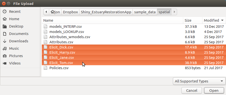
Figure 8. Upload one or more expert prediction tables. Hold the ‘Shift’ key and click to select multiple contiguous files for upload, or hold the ‘Control’ key and click to select multiple individual files.
The file names should contain the keyword “Elicit”, as illustrated in the figures above and below. This will allow the app to automatically identify the correct tables when assigning prediction sources to each subobjective. Immediately after the files have been uploaded the app will attempt to convert all four-point elicitation tables to statistical distributions, and when it is complete the file names are displayed to the right of the uploader in a table with a checked checkbox next to each name (Figure 9). The checkbox permits individual experts to be quickly “knocked out” of the prediction process without re-uploading all of the tables. The knock-out process can help identify experts with more extreme predictions than others, and may be useful during sensitivity analysis.
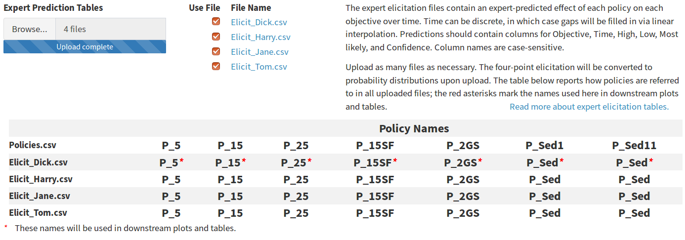
Figure 9. The table of elicitation file names and knockout checkboxes (top) and the policy names table (bottom). The policy table may contain multiple vector policies, so policy names used in the app are taken from the expert prediction tables if possible.
The policy names table lists the column names in the policy table above the unique values from the “Policy” column in each expert prediction table. The first row of expert table policies (row 2 in the table) displays a red asterisk after each policy name. The asterisk indicates that the policy names from this file will be used in all tables and figures; this avoids requiring the user to specify a name for multiple vector policies. In the screenshot above, the two right-most columns are labeled “P_Sed1” and “P_Sed11” in the policy table, but they are a multiple vector policy that will be presented with the name “P_Sed” as labeled in the first expert table and matched using fuzzy-matching.
Model Predictions
There two types of model prediction tables: those that report results as a function of a policy configuration (lookup) and those that report results as a function of time (interpolated). Lookup models assume the action occurs once and the effect remains static for the duration of the decision process (i.e. the number of rows in the policy table), while interpolated models assume the action occurs once but the effect changes over time and must be predicted at multiple time intervals. Both types may be uploaded in a single action by clicking the “Browse” button and holding down “Shift” or “Command” while selecting multiple files (Figure 10). The file names should contain a keyword from the attribute table to allow the app to automatically identify the correct tables when assigning prediction sources to each subobjective. The exact keyword can be created by the user. The only requirement is that the keyword match between the “Model” column in the attribute table and the file name.
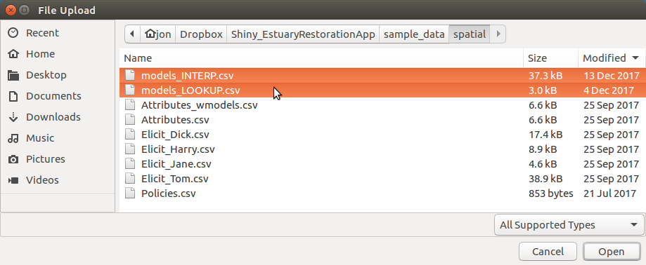
Figure 10. Upload one or more model prediction tables. Hold the ‘Shift’ key and click to select multiple contiguous files for upload, or hold the ‘Control’ key and click to select multiple individual files.
The file names will be displayed as links to the right of the uploader. Clicking a name brings up a modal window that displays the contents of the uploaded file.
The files are automatically sorted into lookup model predictions and interpolated model predictions (Figure 11). The app makes this distinction by first looking for a “Time” column, which is only present in interpolated models. All tables with no “Time” column are then compared to the policy table; if they contain coded actions, they are lookup predictions because the policy actions are reconstructed by pulling codes from the policy file and looking up predictions in the model file. Tables that contain no “Time” column and no coded actions are listed as unrecognizable and are presented on screen with an appropriate error message.
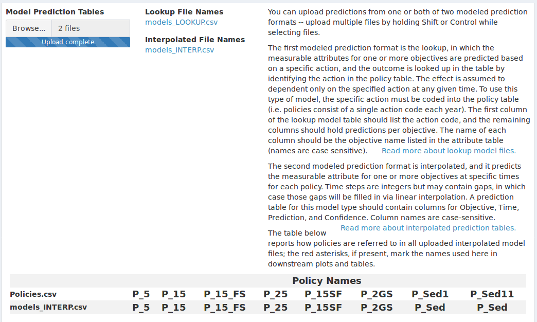
Figure 11. After uploading model prediction tables the policy names in each table are compared to those in the policy table. The policy table may contain multiple vector policies, so policy names used in the app are taken from the expert prediction tables if any are uploaded or from the model prediction tables if no expert predictions are uploaded.
Policy names from all interpolated model prediction tables are added to the table of policy names at the bottom of the screen. If no expert predictions are uploaded, the policy names from the first time dependent model will be used in all tabular and graphical output, as indicated by a red asterisk. When expert predictions are uploaded those policy names will take precedent over names supplied in the model files.
Lookup Predictions
In the lookup model predict tables the coded value in the policy table should appear in the first column of the lookup model table; this column may take any name. In this case the column is named “Gate”, because it identifies the gate opening that yields the modeled values (Figure 12). All subobjectives for which an effect is predicted should occur in subsequent columns, with the predicted effect of each action listed in the appropriate row. The units of each predicted effect should remain constant in each column but may differ between columns. The column names of the subobjective columns must exactly match the subobjective name listed as the most specific level of the objective hierarchy in the attribute table.
| Gate | FloodingDuration | FloodingFreq | MHW | MLW | Ponding |
|---|---|---|---|---|---|
| 1_1 | 0.0000000 | 0.0000000 | -0.96 | -2.87 | 2.91 |
| 1_2 | 0.1292757 | 0.1147842 | -0.27 | -2.56 | 2.93 |
| 1_8 | 1.0822903 | 7.9660239 | 0.37 | -2.08 | 9.20 |
| 2_1 | 0.5042157 | 0.8034894 | -0.27 | -2.71 | 2.81 |
| 2_2 | 1.2972008 | 11.4554637 | 0.59 | -2.52 | 2.99 |
| 2_6 | 2.3139933 | 32.5528007 | 1.81 | -1.88 | 10.80 |
| 3_10 | 2.8096489 | 43.3884298 | 2.51 | -2.16 | 14.20 |
| 4_1 | 1.4007621 | 11.5702479 | 0.60 | -2.68 | 2.94 |
| 4_6 | 3.1733312 | 56.6115702 | 2.76 | -2.46 | 12.87 |
| 4_8 | 3.2150928 | 58.9990817 | 2.94 | -2.40 | 17.09 |
| 5_2 | 2.7458039 | 40.7943067 | 1.95 | -2.75 | 3.57 |
| 5_6 | 3.2910039 | 62.0293848 | 3.03 | -2.61 | 14.58 |
| 6_2 | 2.8095904 | 43.1818182 | 2.19 | -2.78 | 4.06 |
| 6_6 | 3.3238047 | 63.7741047 | 3.23 | -2.69 | 17.16 |
| 7_1 | 2.3122973 | 29.9586777 | 1.43 | -2.75 | 3.36 |
| 7_10 | 3.1299876 | 53.9485767 | 3.63 | -2.60 | 24.05 |
| 9_10 | 3.4375389 | 85.9963269 | 4.30 | -2.36 | 28.72 |
In the example table above predictions for multiple subobjectives are contained in a single column. It is also possible to upload a separate table for each subobjective, but doing so introduces additional work to specify from which table predictions will be drawn.
Interpolated Predictions
Interpolated model predictions have a structure similar to expert elicited predictions. For each objective, policy, and time interval, a predicted effect and confidence are listed in a long-form table (Table 9). Like the expert prediction table, the column names of this table are fixed and case-sensitive.
| Objective | Estimate | Confidence | Policy | Time |
|---|---|---|---|---|
| Accretion | 6 | 70 | P_15 | 1 |
| Accretion | 6 | 70 | P_15SF | 1 |
| Accretion | 6 | 70 | P_25 | 1 |
| Accretion | 6 | 70 | P_2GS | 1 |
| Accretion | 6 | 70 | P_5 | 1 |
| Accretion | 6 | 70 | P_Sed | 1 |
| Accretion | 18 | 70 | P_15 | 3 |
| Accretion | 18 | 70 | P_15SF | 3 |
| Accretion | 18 | 70 | P_25 | 3 |
| Accretion | 18 | 70 | P_2GS | 3 |
| Accretion | 24 | 70 | P_5 | 3 |
| Accretion | 28 | 70 | P_Sed | 3 |
| Accretion | 18 | 70 | P_15 | 5 |
| Accretion | 18 | 70 | P_15SF | 5 |
| Accretion | 18 | 70 | P_25 | 5 |
| Accretion | 18 | 70 | P_2GS | 5 |
| Accretion | 36 | 70 | P_5 | 5 |
| Accretion | 30 | 70 | P_Sed | 5 |
The “Time” column should contain discrete integers separated by intervals of 1 or greater than 1. Intervals greater than 1 will be filled in using a linear interpolation algorithm.
Grouping Subobjectives
To cut visual clutter when presenting scored objectives, the application can collapse multiple subobjectives under a single pseudo-subjobjective and present only the pseudo-subobjective for display. Some of set-up to determine which subobjectives can be collapsed is done in the attribute table: subobjectives are given unique names in the hierarchy column, but can be given non-unique names in the objective column. Subobjectives that share a name in the objective column are candidates for grouping. The groups are arbitrarily designated by the user within the grids of radio buttons presented in the “Group Objectives” tab (Figure 12). Within a single objective-row, a grid of radio buttons contains as many numbered groups as members of that group. The default arrangement assigns each subobjective to a unique group, which means the final score for each subobjective will be presented in all output. By assigning multiple subobjectives to the same group number results for the group will be collapsed in all output, and a weighted average of the scores will be presented with a pseudo-subobjective. Groups are assigned per objective-row; group 1 for any objective will be assigned membership independently of all other objectives.
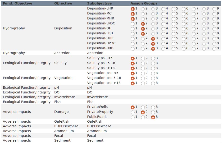
Figure 12. Subobjectives that may be grouped are indicated in the attribute table with a common objective name in the “Objective” column. Subobjectives with common objective names can be divided into arbitrary groups by assigning them to the same group number within each shaded or unshaded row.
In the consequence table, the grouped subobjectives will appear with the objective name and the suffix “_groupX“, where X is the assigned number.
Specify Prediction Sources
The app requires the user to verify the source of predictions for each subobjective before utility can be scored. This is for three reasons: first, the prediction source is specified in the “Model” column of the attribute table with a keyword (e.g. INTERP, LOOKUP, or ELICIT as used in this example) and then matched to a file containing that keyword, and the matching should be checked for errors. Blanks in the prediction sources table are usually caused by missing prediction files, and can be rectified by uploading the correct file or verifying the correct keyword is present in both the attribute table and the file name. Second, it is expected that predictions may initially be elicited from experts but as models are created or adapted the prediction source will shift from elicited to modeled. This is accomplished by adding the predictions to the proper table, then using a spreadsheet program to change the keyword in the attribute table. The prediction sources table should then be reviewed to verify that the sources are up to date with the latest predictions (Figure 13). Third, the prediction sources table can be used to isolate predictions from a single expert for each subobjective.
The default bahavior in the prediction sources table is to match keywords for all model files and merge all expert elicitation files. The selector for expert elicited attributes will initially read “Merge Experts” whenever more than one expert prediction table is uploaded. This means that expert predictions will be merged whenever possible, and will be left alone wherever merging is not possible. Merging is done by averaging the elicited parameters, computing the distribution mean, and then recalculating variance using an unbiased variance estimator.
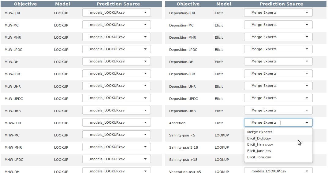
Figure 13. The app uses keyword matching between the attribute table and the uploaded file names to guess the prediction source for each subobjective. Where multiple expert prediction tables are uploaded the default is to merge the predictions from expert elicited sources if possible. Individual sources may designated for subobjectives if desired.
Adjust Utility
Defining Utility
Objectives can all be quantified in some way, usually by measuring some physical attribute. For example, mean high water (MHW) level and dissolved oxygen (DO) exceedances are both objectives; MHW level is measured in feet, and DO exceedances is measured as the number of samples with a DO less than 5mg/L. It is impossible to compare how well a program of action satisfies both the MHW objective and the DO objective in their native units because there is no natural scale upon which the water level and the dissolved oxygen concentration can ever be equal. To accomplish this comparison we must create an artificial scale, which we refer to as the utility scale.
The utility scale always scores the most undesirable measurement as 0 and the most desirable measurement as a 1, regardless of the native units of measurement. In order to apply this scale we need to define in advance what constitutes desirable. For some objectives we may desire the highest measurements, while for others we want the lowest measurements. The desirable direction is our measurement goal, and there is often a point at which we can say we have adequately met our goal.
In addition to recording in advance our goal direction we must also quantify our risk attitude. Risk attitude is harder to intuit than direction because it exists on a subjective gradient that must be characterized by carefully considering how various outcomes affect our level of satisfaction. Thinking of risk attitude in terms of satisfaction is a good way to conceptualize terms like “risk seeking” and “risk adverse”, which describe how quickly we transition from a utility of 0 to a utility of 1. To identify our risk attitude we need to examine whether our satisfaction grows at a constant rate with increasingly satisfying measurements (which would be a “linear” risk attitude) or whether small initial changes are more satisfying than large changes later on (which could be a “risk seeking” attitude), or even the opposite case in which we are not happy with small initial changes and are only happy with large changes later on (“risk adverse”). For example, if 1 DO exceedance makes us twice as happy as 2 exceedances, and 2 makes us twice as happy as 4, we could characterize our attitude as “linear”. If 2 exceedances makes us 4 times as happy as 4 exceedances we might be “risk adverse”.
Risk attitude is a difficult concept to comprehend, and describing it simply as satisfaction leaves us prone to misinterpretation as we attempt to visualize converting measured values to utility. A more complex definition of risk attitude is useful because it can impart a more complex understanding of the concept.
The game theory description of risk attitude has us imagine a magic lottery for a single attribute, such as DO exceedances. Suppose we measure 2 DO exceedances, which is less desirable than 0 exceedances. Now enters our imaginary magic lottery, in which winning allows us to erase those two exceedances. As with any lottery buying a ticket does not guarantee that we will win; instead, the probability of winning is offset by the probability of losing. Now we ask ourselves: how certain must we be of winning (and erasing those 2 exceedances) before we are willing to buy a ticket? If we are willing to play even when our odds of winning are low we consider ourselves “risk seeking”. If we play only when we are fairly certain of a win we consider ourselves “risk adverse”.
Risk And Utility In The App
The utility editor allows the utility function for each subobjective to be parameterized within the app. The two parameters of the utility function include the risk attitude (e.g. “riskSeeking” vs “riskAdverse”) and goal (minimize vs maximize measured values). The default values for these parameters are set in the attribute table using the columns “Utility” and “Direction” (Table 10).
| Risk Attitude | Risk Value |
|---|---|
| ExtremeRiskAdverse | -1.0 |
| RiskAdverse | -0.3 |
| Linear | 0.0 |
| RiskSeeking | 0.3 |
| ExtremeRiskSeeking | 1.0 |
The utility editor uses a slider below the plot to set the risk value continuously from -1 to +1, which in most cases the should offer more granularity than necessary (Figure 14). To permanently change the risk in the attribute table use a spreadsheet editor to change the values in the table to one of the following five attitude keywords. The slider and the goal checkbox are disabled until the “Use default utility” checkbox is unchecked. To return to the default value at any time after editing check this box and the value from the attribute table will be applied.
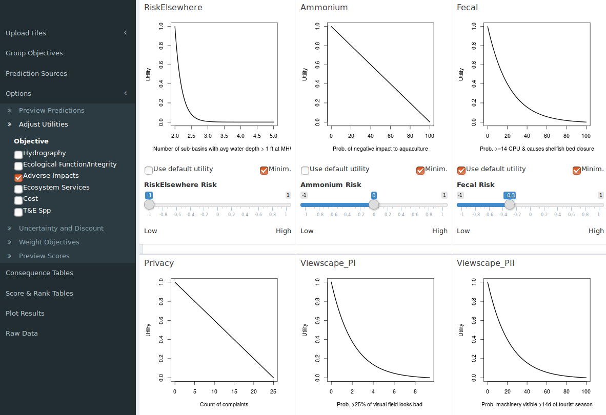
Figure 14. Default utility function parameters for individual subobjectives are derived from two columns in the attribute table; “Utility” and “Direction”. Parameters may be adjusted on-the-fly in the “Options > Adjust Utilities” tab.
The response direction is reversed by checking or unchecking the “Minim.” box. When checked the goal is set to minimize, which means lower measured values will yield higher utility. When unchecked the goal is set to maximize and higher measured values will yield higher utility.
The x-axis labels for these plots are pre-loaded in the app by the project leader and read in as a table of subobjective-label value pairs when the app launches.
Discounting The Future
The Herring River estuary project is designed to assess predicted utility at 25 years into the future, but we expect that users will also be interested in evaluating utility at arbitrary points between project start and the official assessment point. One way to do this is to view the cumulative line plot; another is to employ discounting.
Discounting is a mechanism to estimate the current utility of utility earned in future years. Setting a discount rate less than 1 under “Options > Uncertainty and Discount” indicates that we value utility earned in the future less than we value utility earned in more proximal time frames (Figure 15).
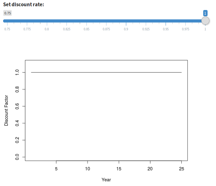
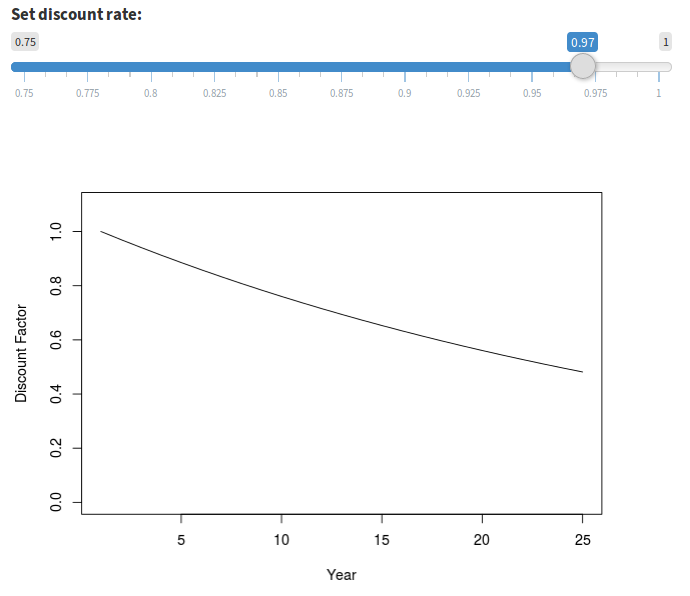
Figure 15. Two discounting scenarios: no discounting (discount factor of 1.0) at left, and fairly extreme discounting (discount factor of 0.97) at right. A discount factor of 0.97 values a unit of annual utility in year 25 approximately half as much as it does in year 1.
For some plots, such as the performance plot, the results at the end of 25 years are explicitly compared to the highest performance scenario by setting the y-axis of the plot to the maximum possible utility score. When employing discounting it appears as though lower performance was achieved.
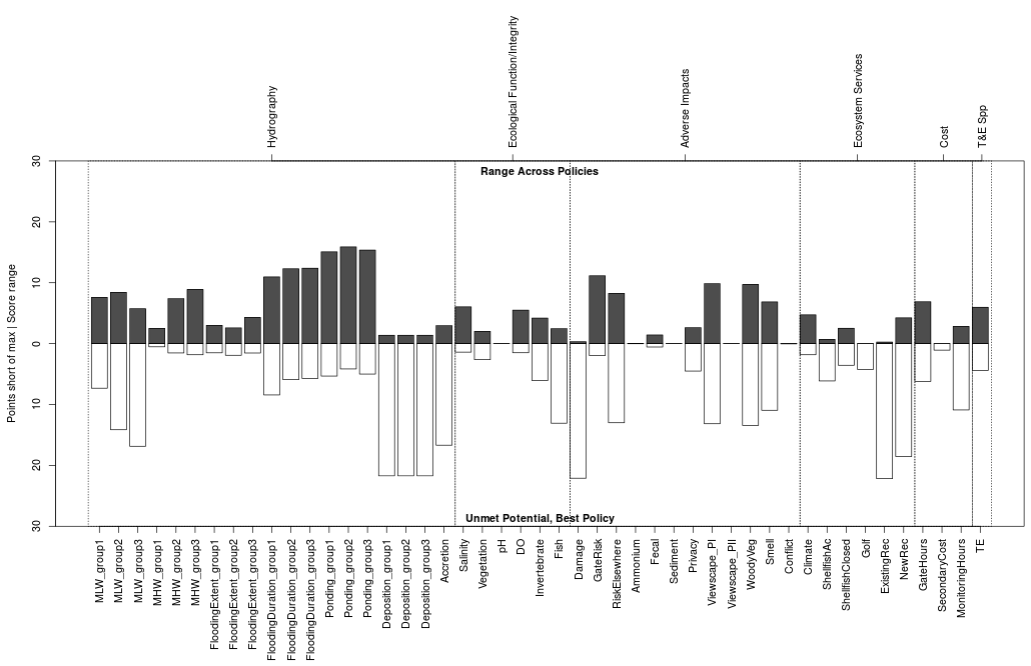
Figure 16. Performance plot with the default discount value of 1.
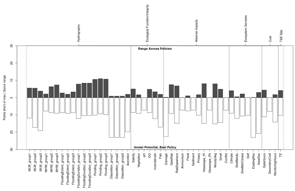
Figure 17. Performance plot with the a discount value of 0.97. Compared to Figure 16 above it appears that none of the policies delivered maximum utility for any subobjectives (pale bars on lower half of plot). Consequently, the spread between best and worst performing policies was narrower (dark bars on top half of plot).
Sensitivity Analysis
Sensitivity analysis offers the opportunity to explore how the outcome may change under slightly different predictions. When small changes to a prediction yields a large change in the outcome, the decision is said to be sensitive to that subobjective. This app allows users to isolate individual subobjectives and quickly recalculate the outcome, which makes it easy to identify those that exhibit disproportional influence in the decision process and those which are robust to changes.
Above we noted that individual expert predictions may be knocked completely out of the analysis, or a single expert may be selected to supply predictions for a subobjective rather than merging all expert predictions for that subobjective. There are two other ways to dissect which subobjectives are susceptible to changes in predictions and which have a disproportional influence in the decision process. The first uses the expert predicted range and uncertainty values; the second uses value weighting to emphasize select subobjectives over others.
Evaluating Expert Uncertainty
Only the predictions that are elicited from experts can be used to estimate a range of possible outcomes. Although it is possible to offer the same range for model predictions, the models currently in use for this project only report a point estimate, they do not report a range or a confidence value.
Expert predictions come in with four values: low, most likely, high, and confidence. These four values allow a distribution to be constructed which is used to estimate the outcome in alternative cases, including worst, best, and most likely scenarios. These case scenarios are designed to offer best estimates of realistic boundaries for the final outcome assuming for the worst case that all subobjectives are affected as negatively as they could be, or for the best case that all subobjectives are affected as positively as they could be. During the elicitation process each expert may also indicate how confident they are that the value will fall within their predicted range. The confidence estimate is reflected in the “Alpha” (or \(\alpha\)) column, which is alpha as applied to a two-tailed hypothesis test. In a two-tailed hypothesis test, the confidence interval is defined as the values between \(\left\{\frac{alpha}{2}, 1-\frac{alpha}{2}\right\}\). The app allows us to explore how sensitive our scores are to changes in expert confidence by computing scores at various alpha values not selected by the expert but selected instead on the Options > Uncertainty and Discount tab (Figure 18). Since most users will be more familiar with the general concept of uncertainty than the concept of alpha in two-tailed hypothesis testing, the app allows the user to set a range of uncertainty rather than setting alpha directly. Uncertainty and alpha are related in that maximum uncertainty occurs at a probability of 0.5, which is an alpha of 1. The relationship between uncertainty and alpha is \(uncertainty = alpha-0.5\).
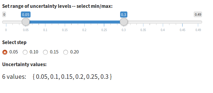
Figure 18. Uncertainty range is defined by moving each end of the slider independently.
Value Weighting Objectives
The app allows specifying as many as three nested objective hierarchy levels in the attribute table. Weights for each level and each objective are specified independently. In Figure 19 below, there are six fundamental objectives. For the first fundamental objective (Hydrography), seven objectives are listed. For the first objective (MLW), nine subobjectives are listed. The remaining fundamental objectives are not shown, nor are the subobjectives for the remaining listed objectives.
Figure 19. Complete list of subobjectives for the objective “Mean Low Water” (MLW) within the fundamental objective “Hydrography”. Each level depicted in the diagram is weighted relative to other objectives within the level. Therefore, subobjectives in “MLW” are not directly weighted relative to subobjectives within “FloodingExtent” (not shown), although the objectives “MLW” and “FloodingExtent” may be weighted relative to one another directly.
At the top of the application page for editing weights is a box for specifying the number of weight scenarios to include in the output. For each weight scenario you can add a custom name (spaces will be removed). Weights intialized within the app will be assigned a default name of “WeightingX”.
All values in the boxes beneath each weighting name can be edited (Figure 20). The default behavior is to weight each objective at each level equally and set the sum of all weights to 1. You can assign weights using any value; for example, you may use integers (e.g. 1, 2, 3) to set weights in which a weight of 2 indicates valuation twice as high as a weight of 1. To rescale the weights so they sum to 1 you can click the “Norm” button at the top of the column, and to reset the weights to the default of equal you can click the “Reset” button. In the column contents you can click the editing pencil icon to the left of each editing box to edit the next nested set of objectives. The pencil icon will appear regardless of whether nested objectives exist (Figures 21 and 22). In cases where only one objective level exists the same objective name will be repeated on the popup. It is not an error to change the weight for a single objective in a popup; however, because each nested level of weights are evaluated in isolation the weight will always be scaled to a value of 1 at all levels for which competing objectives are absent. The final weights are calculated in the app by normalizing all weights for each objective and eacy hierarchy level to sum to 1, then multiplying through the objectives and levels.
When uploading weights in the attribute table weights should be specified relative to all subobjectives, so the entire weight column would sum to 1 in a spreadsheet program. The app will normalize the weights internally regardless of whether they already sum to 1 when uploaded.
If you assign weights in the app and wish to attach them to your attribute table you can do so in the “Raw Outputs” tab.
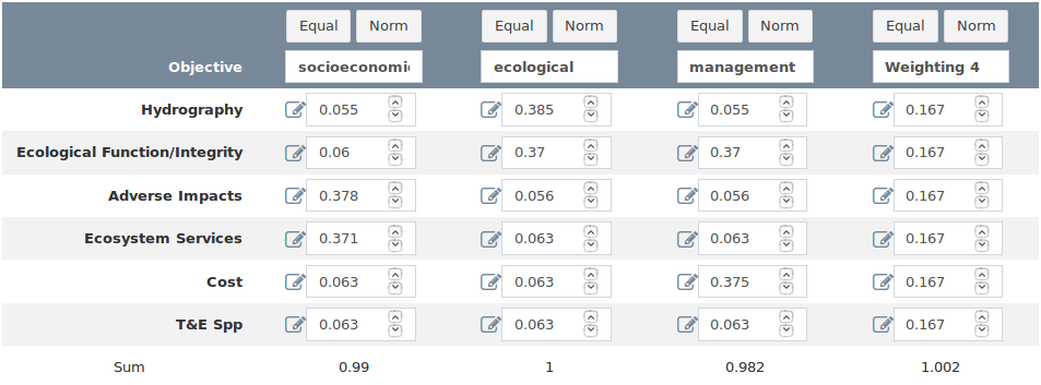
Figure 20. The weighting table for the fundamental objective level. The pad and pencil icons to the left of each input box are buttons to launch a nested level-editor.
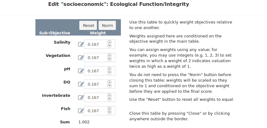
Figure 21. The weighting table for the objective level. The pad and pencil icons appear regardless of whether nested subobjectives exist.
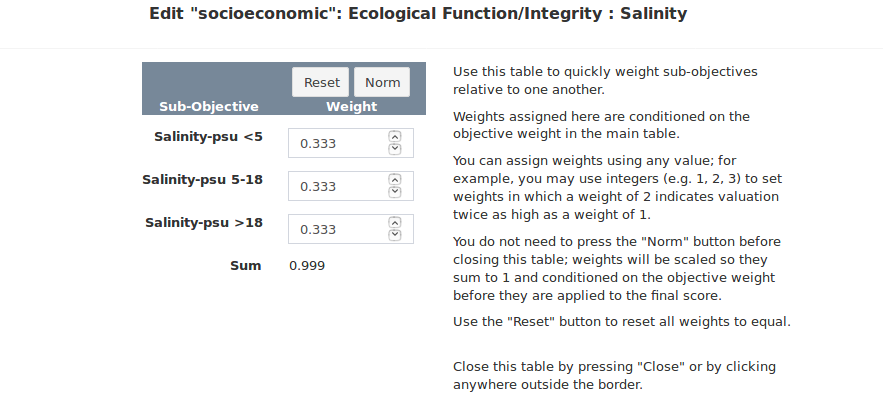
Figure 22. The weighting table for the subobjective level. Attempting to edit nested subobjectives where none exist will always yield a weight of 1 after normalization.
Final Results
The utility scores produced by the app are presented in a variety of tables and figures. The goal is to offer a diverse set of cross-sections through the predicted utilities, some of which can be used to simply convey the resulting utility and some of which can highlight strengths and weaknesses of policies relative to one another to optimize management decisions.
Throughout the application the utilities are displayed in a consistent format: anywhere the subobjectives are listed individually the utility scores are discounted but not weighted, and anywhere the utility scores are listed in aggregate they are both weighted and discounted. There is one exception to this pattern: it is an option to view weighted and discounted individual subobjective utilities in the Options > Preview Utilities menu.
The Consequence Table
This table lists all subobjective groups and the predicted utility for each policy at the end of the duration of the policy table (Figure 23). Each subobjective can score anywhere from 0 (worst) to 1 (best) in each policy each time step. If a subobjective achieves full utility in each time step, the resulting total utility will be equal to the number of time steps in the policy table. The range of scores in the consequence table is therefore between 0 and the number of rows in the policy table. The weights are listed for reference between the subobjective name and the policy utiity, but they are not applied to the predicted utility values.
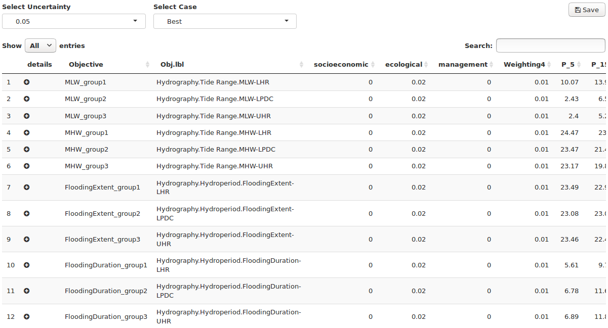
Figure 23. Consequence table with three subobjective groups defined for each objective. Scroll right in the app to see all policy scores.
To the left of each subobjective name is a circular button (Figure 24). The button is blank by default, but where multiple subobjectives are grouped under a single objective the button is filled in with a + icon, and the utility displayed in the row is the average utility for the group. Clicking this button expands the row and shows a subtable, in which the exact utility for each subobjective can be looked up.
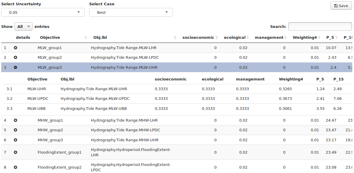
Figure 24. Expand/contract subobjective group subtables by clicking the filled circle to the left of the “Objective” column. Weight values in the expanded subtables are relative within the subtables rather than to the entire parent table.
Score Table
The application is designed to distill the predicted effects of each policy on each subobjective to a single utility score which can be compared across policies. In addition to the single score per policy additional information are brought into the final score table, including multiple value weighting schemes and a number of estimates useful for determining the sensitivity of the process to expert opinion.
The score table lists the final utility for each policy at the final time in the policy table (Figure 25). The scores for each policy listed in columns much like the consequence table, but all subobjective scores are summed at each time step. The sum of scores for each year is then scaled to range between 0 and 1 and the scores are summed across time steps. The scores therefore range between 0 and the number of rows in the policy table. On the right side of the table the last four columns are “Case”, “Alpha”, “Wt”, and “Uncertainty”. These columns list the parameters of scores calculated with the range of expert opinions provided by each expert during elicitation. For each weighting scheme, a score is computed for each uncertainty value in the best and worst case scenarios.
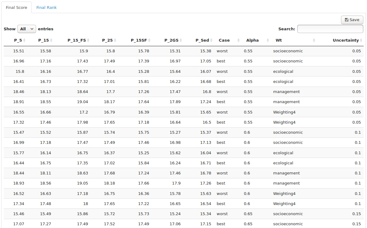
Figure 25. The final score table blends results and sensitivity analysis by presenting weighted, discounted scores for each weight/case/uncertainty scenario.
Rank Table
Once the scores for each policy have been computed for each weighting scheme, case and uncertainty level, the simplest way to compare policies is to rank the policies by score from highest to lowest. The rank table does exactly this, allowing you to quickly identify which policy had the highest score (and hence the lowest rank) while also displaying whether changes in weighting scheme or expert uncertainty affected the rank (Figure 26). The score table are the rank table are accessible as tabs across the top of the page.
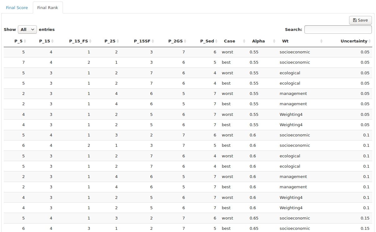
Figure 26. The final rank table displays the rank of each policy for each weight/case/uncertainty scenario.
Plotting
The plot options are depicted as tiles in the “Plot Results” tab (Figure 27). The plots preserve the app format wherein anywhere the subobjectives are listed individually the utility scores are discounted but not weighted, and anywhere the utility scores are listed in aggregate they are both weighted and discounted.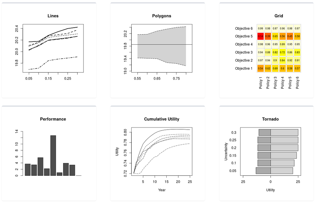
Figure 27. The plot type selector from the “Plot Output” tab.
Each tile is a button that launches a plot builder. The plot builder typically offers a handful of parameters that can be customized about each plot, including the plot and axis titles. At the top-right of the plot builder are buttons that allow users to save either the plot image (as a PNG file) or the data behind the plot (as a CSV file). It is not necessary to specify the file extension in the name of each download. When the image is saved the resolution and font-size can be specified to shape the plot the intended use. To close the plot builder click anywhere around it, or scroll to the bottom and click the close button.
The performance plot is designed to help evaluate whether the range of policies offers an adequate set of choices from which an optimal path forward can be selected (Figure 28). The plot consists of two barplots: the upper one grows up from the zero line and the bottom one grows down from the zero line. The X-axis lists each subobjective group, and the Y-axis is cumulative utility both above the zero line and below it.
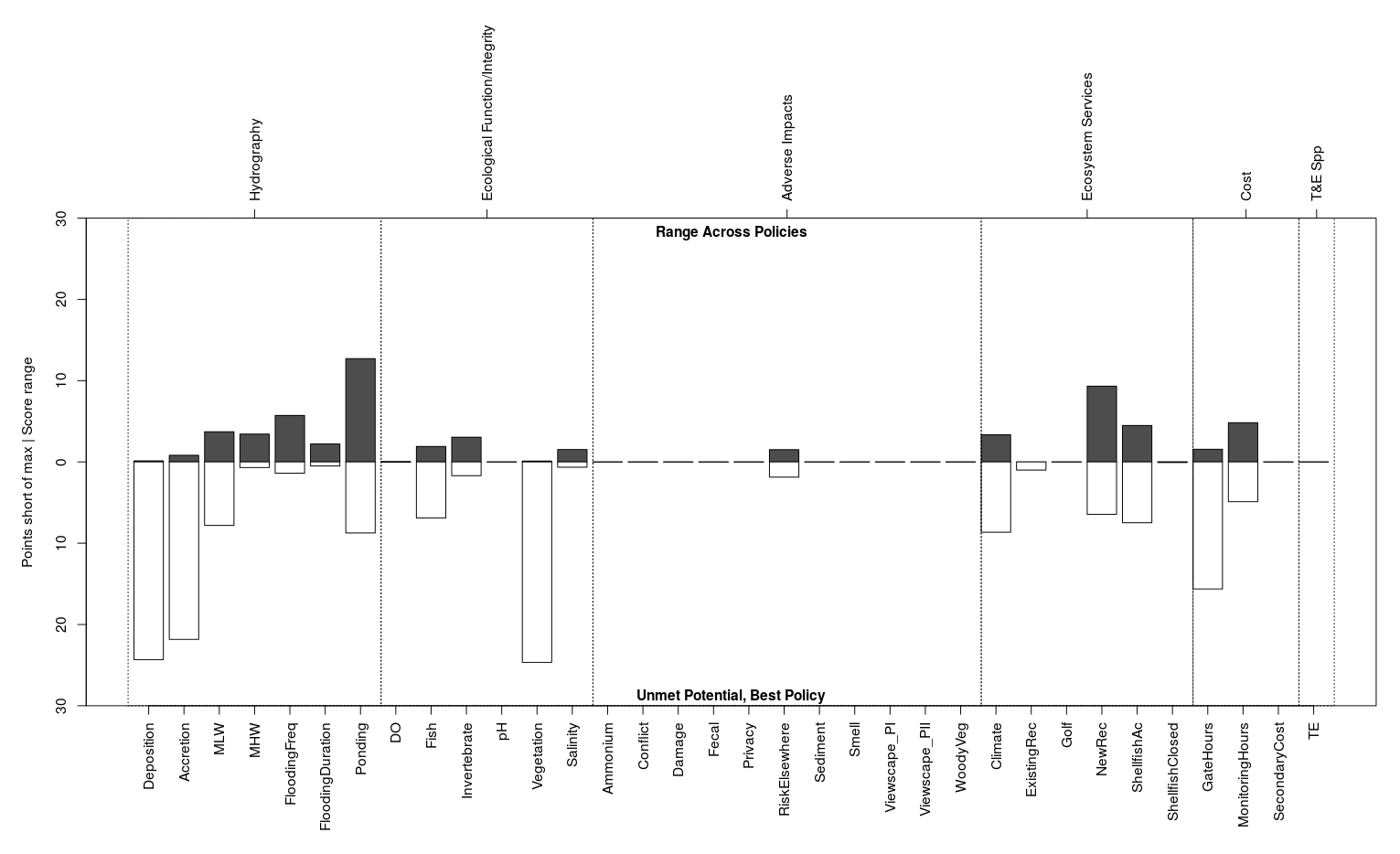
Figure 28. The performance plot illustrates the extent to which subobjectives are satisfied by at least one policy and which are satisfied by all policies.
The title of the upper barplot defaults to Range Across Policies, and it displays the score spread between the best-performing and worst-performing policy for each subobjective group as a dark bar. If all policies score similarly for a subobjective the bar will be small, and if the bar is large it indicates that the policies are not equally addressing that subobjective. Click on a bar of interest to identify the highest scoring policy and lowest scoring policy.
The title of the lower barplot defaults to Unmet Potential, Best Policy, and it displays how many utility points the best-scoring policy stopped shy of the maximum as a light bar. If the best policy reached the maximum possible score the bar will be small, and if the bar is large it indicates that none of the policies are satisfying that subobjective. Click on a bar of interest to identify which was the best policy (Figure 29).
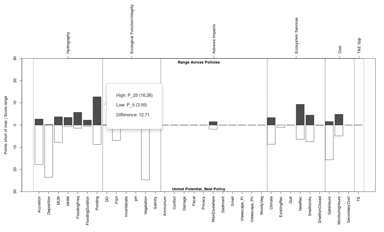
Figure 29. Clicking the performance table brings up a box defining which policies are best and worst performing for each subobjective.
There are four extreme cases to watch. In the first case there will be no dark top bar and no light bottom bar, indicating that all policies performed equally well. In the second case the dark top bar will be small and the light bottom bar will be tall, indicating that all policies performed poorly. In the third case the dark top bar will be tall and the light bottom bar will be small, indicating that at least one policy performed very well and at least one performed poorly. In the last case both the dark top bar and the light bottom bar will be roughly half-height, indicating that at least one policy performed poorly but no policy’s performance was fantastic.
The cumulative utility plot can be configured to display either the score-to-date at each time step (annual accrual) or the average score for all subobjectives at each time step (Figure 30). The line type and Y-axis remain static as policies are selected and deseleced at the top-left.
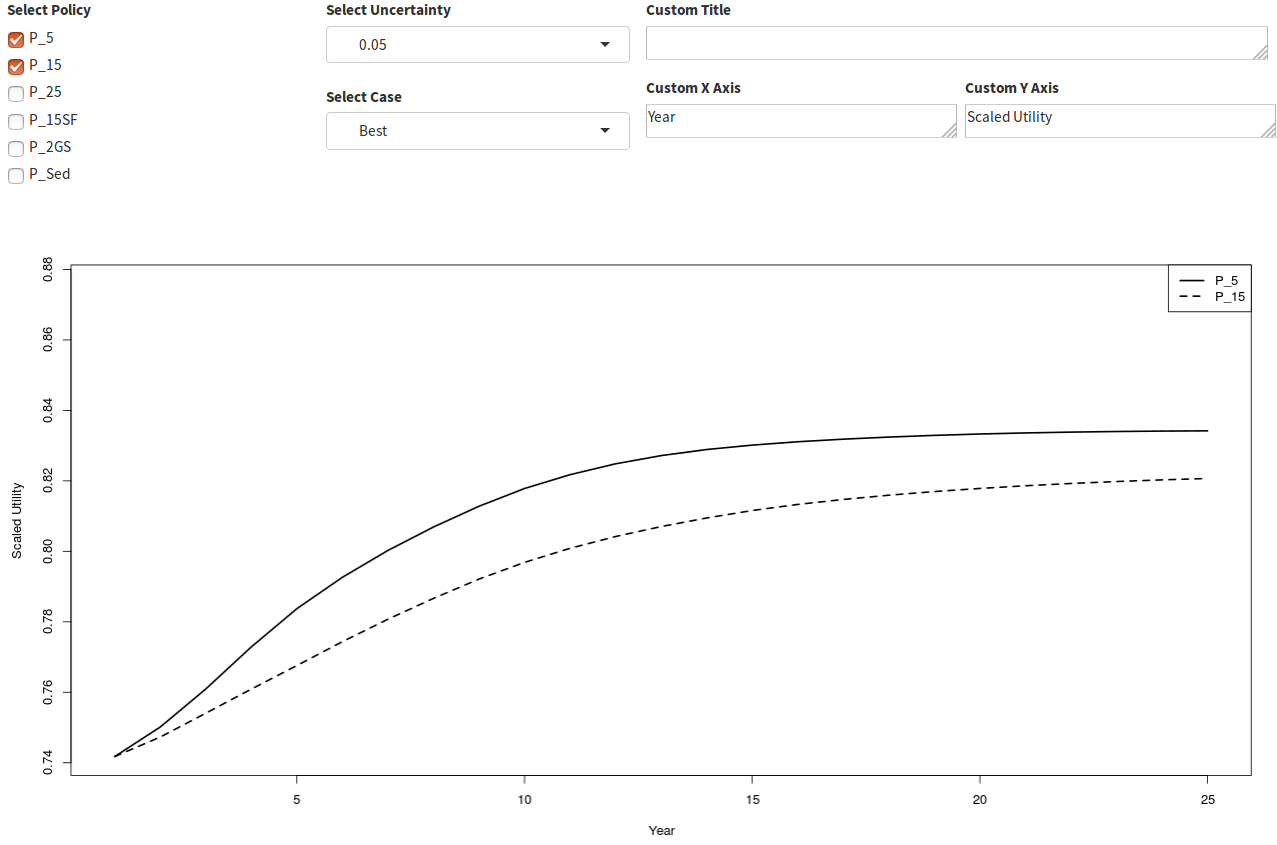
Figure 30. The utility accrued by all subobjectives at each time step by policy.
Saving Output
An important feature of any long-term decision is the ability to recall the reasoning behind all decisions, no matter how long ago they were made. The tradeoff app offers two mechanisms for this purpose. The first is the option to document decisions with downloadable tables and figures. The second is the option to download the entire analysis in a compressed file and restore all settings to the saved values at any time in the future. The compressed file is saved using the R data serialization format which will use the RDS extension.
To download the entire analysis use the button with the disk icon in the upper right corner. All screen inputs are saved in their current state. Inputs that have not yet been created are not stored, or are stored with empty values and will revert to default values when the analysis is restored.
Restoring A Saved Analysis
To restore a saved analysis use the button with the upload from disk icon in the upper right corner and select the RDS file you wish to upload. The RDS file contains all raw data and screen control values, and the app will behave as if you had just uploaded the raw data files and it will recompute all downstream products using the restored screen values.
Server Disconnection (gray screen)
It is intended that users progress through the navigation menu from top-to-bottom, uploading files in the same order they are presented on-screen. At the bottom of each form “forward” and “back” navigation buttons facilitate orderly progression through the app. Once the tables have been uploaded most parameters can be adjusted in any order to allow the user to explore any number of “what-if” scenarios without resetting the app. Some combinations of adjustments may cause disconnection from the server, which disables all forms and turns the screen gray. In these cases it is necessary to refresh your browser and re-upload all tables. If the user encounters persistent server disconnections, a bug report to the developers may be sent from within the app using the menu at the top-right of the screen.