spplot and ggplot both make maps in R, but both are hard to use. Are base graphics any easier?
When it comes to mapping in R, you can take your pick of methods. If you are reading this post, you’ve probably already done a fair amount of web searching and seen a few other popular sites–you’ve probably searched the web a couple of times because mapping in R is tedious. I’ll single out a useful site that I refer to regularly, plus it links to many other excellent pages: https://pakillo.github.io/R-GIS-tutorial/. Go, follow the link and look around there, and then come back and see what the base graphics have to offer.
The two popular methods mentioned both have pros and cons:
| sp::spplot | ggplot2::ggplot | |
|---|---|---|
| Fine control of overlays for a professionally finished look. | Fine control of overlays for a professionally finished look. | |
| Uses lattice, an implementation of Trellis graphics for R. | ggplot is the grammar of graphics, which is also a whole different plotting language implemented in R. |
Well, it turns out they both have the same pro and the same con. In any case, neither plays well with R’s base graphics, which is a bummer for me because I’ve finally memorized the entire list of par options. While the trend-following part of me wants to learn ggplot because the plots are slick and colorful, the swim-against-the-current, roll-your-own-everything part of me prefers a good old-fashioned black-and-white line graph. I might be in the minority on this one, but I happen to really like the austerity of plots produced by the base graphics.
For mapping I am usually in a small hurry, so oftentimes I use the base graphics because I think they require less setup: read in a layer, send the plot command, and be done.
Let’s run through a quick example, and you can decide whether this sounds painful compared to ggplot. Before we start, I’d like to make a quick note about how we can find package help.
Getting help with plot methods
Finding help for S4 methods takes a little getting used to. What I need to re-learn every month or so is that the methods package extends functionality of the '?' function, so as you might get help for an S3 plot method with ?plot or ?plot.data.frame, you get help for an S4 method such as plotting an object of class SpatialPoints with the command method?plot('SpatialPoints'). Its a little more cumbersome compared to S3 method dispatch, but for the most part I believe the S4 methodology is worth the hassle, so I put up with it.
Quick choropleth mapping with base graphics
The general outline of our task today is:
- Get the homes for sale data.
- Aggregate the data by town.
- Plot the aggregated data.
- See what can be done to make ourselves more proud of the plot.
1. Get the data
To keep this simple I’ll just read in some data rather than finding it right now. Our sample data today will be the subject of a future post: homes for sale in Vermont, scraped from Zillow’s website. I’ll read in a snapshot of homes for sale on May 1, 2016.
zdata <- read.csv('data/FS_2016May01.csv')

# Get a random preview of the table
zdata[sample(1:nrow(zdata), 20),]
##                z_id                                          address
## 86  zpid_2098805784                      Hathaway-Trl-Dover-VT-05356
## 505 zpid_2098847499 83-S-Jefferson-Rd-39-R-South-Burlington-VT-05403
## 306   zpid_75444614     3534-Sawnee-Bean-Rd-Thetford-Center-VT-05075
## 350 zpid_2144685253          3-Haycorn-Hollow-Rd-South-Hero-VT-05486
## 504   zpid_92005276                333-Lower-Main-W-Johnson-VT-05656
## 166 zpid_2107354132                  12-Ketch-Rd-Grand-Isle-VT-05458
## 21    zpid_12651227                   80-Ward-St-Burlington-VT-05401
## 206   zpid_75459794               17-W-Crystal-Hvn-Bomoseen-VT-05732
## 423 zpid_2102587266                      752-Cook-Rd-Barton-VT-05822
## 204   zpid_75432590                  1-Twin-Ct-Saint-Albans-VT-05478
## 395 zpid_2098863215                     850-Park-St-Brandon-VT-05733
## 349 zpid_2098898520     236-Qtr-I-I-Jackson-Gore-Inn-Ludlow-VT-05149
## 8     zpid_81613208           21-Glen-Ridge-Ln-Saint-Albans-VT-05478
## 96    zpid_75452756                  5695-Route-14-Irasburg-VT-05845
## 302 zpid_2098865675      N15-Stonehedge-Dr-South-Burlington-VT-05403
## 383 zpid_2133613637           1033-Portland-St-St-Johnsbury-VT-05819
## 131 zpid_2098804675                  0-N-Route-30-N-Sudbury-VT-05733
## 486 zpid_2116639515                    127-South-St-Rutland-VT-05701
## 304   zpid_75467230                  15-Ewing-St-Montpelier-VT-05602
## 301 zpid_2098842580           1903-Vt-Rte-100-South-Duxbury-VT-05660
##          lat      long  price beds baths sqft        acres yr_built
## 86  42.97606 -72.86359 300000   NA    NA   NA        95.20       NA
## 505 44.43980 -73.19180 424900  3.0     3 1775           NA     2016
## 306 43.87669 -72.28931 555000  3.0     2 2317        95.00     1978
## 350 44.64687 -73.28166 175000  2.0     1  732         1.00     1920
## 504 44.63641 -72.68568 200000  3.0     2 1900         0.40     1890
## 166 44.70205 -73.29071 113000   NA     1  512           NA       NA
## 21  44.48743 -73.22118 199900  2.0     1  928           NA       NA
## 206 43.66443 -73.19317 450000  3.0     2 1892 738963950.69     1940
## 423 44.76370 -72.11372  65000   NA     1  480        10.40     2004
## 204 44.79575 -73.08109 221500  3.0     2 1572         0.51     1983
## 395 43.80371 -73.07260 230000  6.0     3 3202         4.00     1850
## 349 43.40596 -72.69549  31000  0.5     1  390           NA     2003
## 8   44.90524 -73.06560 197000  3.0     1 1458           NA       NA
## 96  44.79241 -72.29267 159900  3.0     1   NA        10.00     1978
## 302 44.43470 -73.19590 244000  4.0     3 2076           NA     1988
## 383 44.42179 -71.99540  89900  3.0     2 1508         0.50     1900
## 131 43.79329 -73.20483  70000   NA    NA   NA         5.53       NA
## 486 43.60036 -72.98443  75000  4.0     2 3006 971089554.22     1919
## 304 44.26341 -72.56707 230000  3.0    NA 1476           NA     1900
## 301 44.26225 -72.78795 340000  3.0     3 2296        35.00     1988
Data scraped from a web page is bound to be missing a fair number of values, and that seems to be true here. As far as I can tell the lat and long fields are intact though.
I’m going to limit this post to vector data so I can keep the packages to a minimum.
Now I can convert our zillow data to a Spatial object and read in a shapefile with Vermont town boundaries:
library(rgdal)
library(sp)
library(raster) # for its summary print method

# Convert zillow data to a SpatialPointsDataFrame using the International Association
# of Oil & Gas Producers EPSG code for WGS84 projection:
z.spat <- SpatialPointsDataFrame(zdata[,c('long', 'lat')], data=zdata, proj4string=CRS("+init=epsg:4326"))

# Read in town boundaries
vt.twn <- readOGR(dsn='data/Boundary_TWNBNDS', layer='Boundary_TWNBNDS_poly')
## OGR data source with driver: ESRI Shapefile
## Source: "data/Boundary_TWNBNDS", layer: "Boundary_TWNBNDS_poly"
## with 255 features
## It has 5 fields
vt.twn
## class       : SpatialPolygonsDataFrame
## features    : 255
## extent      : 424788.8, 581562, 25211.84, 279799  (xmin, xmax, ymin, ymax)
## coord. ref. : +proj=tmerc +lat_0=42.5 +lon_0=-72.5 +k=0.9999642857142857 +x_0=500000 +y_0=0 +datum=NAD83 +units=m +no_defs +ellps=GRS80 +towgs84=0,0,0
## variables   : 5
## names       : FIPS6,  TOWNNAME, CNTY, SHAPE_area, SHAPE_len
## min values  :  1005,   ADDISON,    1,  100122404, 10203.963
## max values  :  9095, WORCESTER,    9,   99942616,  9386.921
# transform town boundary projection to match the points
vt.twn <- spTransform(vt.twn, CRSobj=proj4string(z.spat))
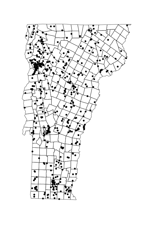
To see how quickly the base graphics get us up and running with a visual, lets plot the points.
plot(vt.twn)
plot(z.spat, add=TRUE, pch=19)
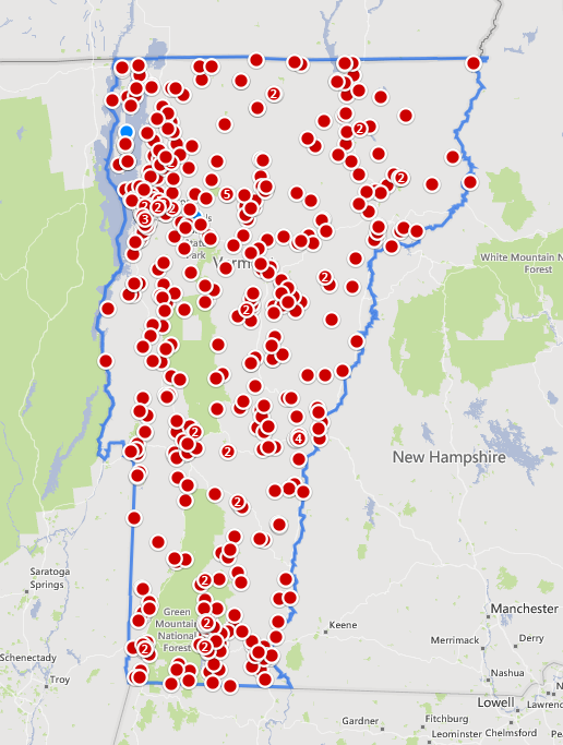
For a quick side-by-side comparison, here’s our plot on the left and Zillow’s map on it’s home site grabbed the same day:
2. Aggregate the data by town.
Now that everything appears to be in order, I’d like to shade the map according to one or more of the attributes in the data. I’ll begin with home median home price by town. The package sp has a great spatial aggregation method, so there’s no need to explicitly do any overlay.
price <- aggregate(z.spat['price'], by=vt.twn['TOWNNAME'], FUN=median, na.rm=TRUE)
price
## class       : SpatialPolygonsDataFrame
## features    : 255
## extent      : -73.4379, -71.46528, 42.72696, 45.01666  (xmin, xmax, ymin, ymax)
## coord. ref. : +init=epsg:4326 +proj=longlat +datum=WGS84 +no_defs +ellps=WGS84 +towgs84=0,0,0
## variables   : 1
## names       :   price
## min values  :   50000
## max values  : 1395000
# see what values price has
hist(price$price, main='Median home price by Vermont town', xlab='Price in US Dollars')
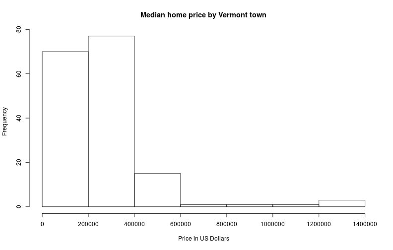
Judging from the histogram, most homes for sale in Vermont are asking less than $400,000, but several are asking more than $1.2M. This is going to make shading this map a little harder than I initially expected, and it is going to bump up the complexity of the code we write.
I’ll start with a simple linear shading scheme, using the built-in heat.colors gradient for the col argument.
plot(price['price'], col=heat.colors(255),
    main='Median home price in Vermont, by town', axes=TRUE)
box()
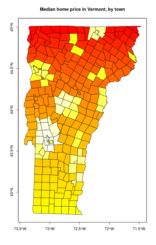
OK, it is clear from this plot that the method just colors towns by plot order rather than by the underlying value in the attribute table. Another complication; maybe this is not as simple as I initially expected.
After testing various options for a solid hour, here’s what I came up with. I can’t change the plot order, but I can change the coloration. I need to rearrange the colors in heat.colors() and take them from a simple ramp to a vector arranged according to the median home price per town. The steps I’d like to perform are:
- Use the
histfunction to compute price bins.- Assign the prices to bins.
- Use the assigned bins to rarrange the color vector.
- Plot the map.
- Return an invisible vector of bins to use in the legend.
I’m going to do this by defining a quick custom function. The “quick” part is that I’m not including any argument checking characteristic of a high level function in a package.
The following function will perform the above steps.
choropleth <- function(
    sp,         # R object--any feature derived from package sp.
    attrib,     # Attribute name in the table; length 1 character vector.
    color.ramp=heat.colors,  # The color ramp to use. Can also use colorRampPalette().
    hist.args=NULL,  # Named list of additional arguments to hist(), excluding `plot`.
    ...         # Additional arguments to plot().
) {
    spa <- na.omit(sp[[attrib]])
    # Step 1 : compute price bins
    ha <- list(x=spa, plot=FALSE)
    ha <- c(ha, hist.args)
    bins <- do.call(hist, ha)$breaks
    # Step 2: assign data to bins
    bin <- rep(NA, length(spa))
    for(i in length(bins):1) bin[spa > 0 & spa <= bins[i]] <- i-1
    # Step 3: rearrange color vector
    sp$bin <- NA
    sp[['bin']][!is.na(sp[[attrib]])] <- bin
    customcolor <- rev(color.ramp(length(bins)-1))
    customcolor[1] <- "#FFFFFF"
    # Step 4: plot
    plot(sp, col=customcolor[sp$bin], ...)
    # Step 5: return a vector to use for the legend
    low.bin <- bins + 1
    low.bin[1] <- 0
    oldopts <- options(scipen=100000)
    on.exit(options(oldopts))
    invisible(paste(low.bin[1:(length(low.bin)-1)], '-', bins[2:length(bins)]))
}
Now the first test. I’m going to put a legend on right away, just to see how it looks.
x <- choropleth(price, 'price',
    main='Median home price in Vermont, by town', axes=TRUE)

legend('bottomright', legend=x, fill=rev(heat.colors(length(x))),
    bty='n', title='$US')

box()
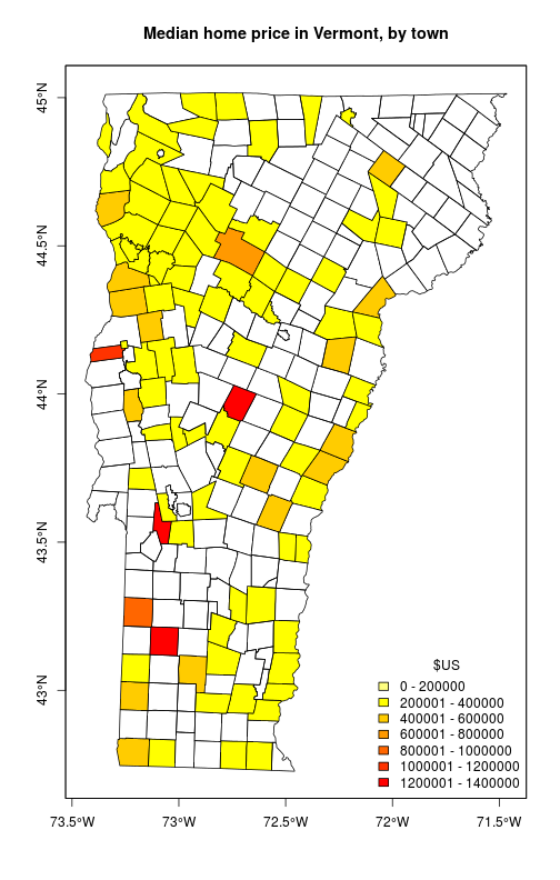
This looks more-or-less OK, but I’ve plotted two oranges and three reds that I can’t distinguish, and my legend shows two yellows but the lighter one is probably white in the map. I need to fix the white, and follow it up with more distinct colors. I will solve this with a one-two punch to improve my odds of success. First I’ll set up my color ramp to transition between three colors. Second, since I’m using hist() to compute breaks, I can pass breaks into the above function manually (which almost defeats the purpose of using hist). I want finely divided breaks between 1 and $450,000 and then one category for all prices higher than $450,000.
fill.col <- colorRampPalette(c('red', 'orange', 'lightgray'))

x <- choropleth(price, 'price', color.ramp=fill.col,
   hist.args=list(breaks=c(0, 0, seq(250000, 450000, by=100000), 1500000)),
   main='Median home price in Vermont, by town', axes=TRUE)

fill <- rev(fill.col(length(x)))

fill[1] <- 'white'

legend('bottomright', legend=x, fill=fill, bty='n',
   title='Asking Price ($US)', box.cex=c(2, 0.8))

box()
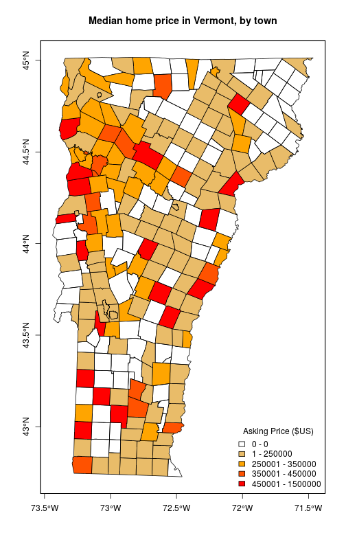
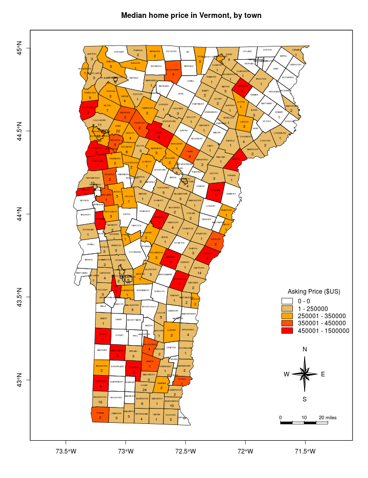
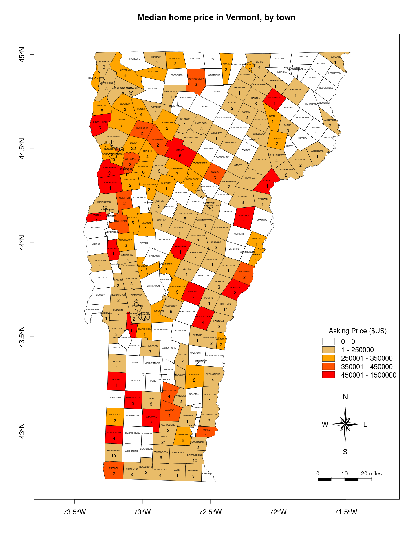
Now some finishing touches that I’ll discuss more in a future post: a scale bar, a north arrow, larger fill-boxes in the legend, and labels for both town name and count of homes for sale. Click on the map to see it larger.
source('mapFunctions.R')
source("http://www.math.mcmaster.ca/bolker/R/misc/legendx.R")

fill.col <- colorRampPalette(c('red', 'orange', 'lightgray'))

x <- choropleth(price, 'price', color.ramp=fill.col,
    hist.args=list(breaks=c(0, 0, seq(250000, 450000, by=100000), 1500000)),
    main='Median home price in Vermont, by town', axes=TRUE)

fill <- rev(fill.col(length(x)))

fill[1] <- 'white'

legend('bottomright', legend=x, fill=fill, bty='n', title='Asking Price ($US)',
    box.cex=c(2, 0.8), inset=c(0, .25))

scalebarTanimura(loc='bottomright', length=0.3960193, inset=c(0.52, -0.75),
    mapunit='degrees', unit.lab="miles")
northarrowTanimura(loc='bottomright', size=0.4, inset=c(0,0), mapunit='degrees')

text(x=coordinates(vt.twn)[,1], y=coordinates(vt.twn)[,2],
    labels=vt.twn$TOWNNAME, pos=3, offset=0.3/2, cex=0.3)

count <- aggregate(z.spat['price'], by=vt.twn['TOWNNAME'], FUN=length)

text(x=coordinates(vt.twn)[,1], y=coordinates(vt.twn)[,2],
    labels=count$price, pos=1, offset=0.6/2, cex=0.6)

box()