I think OHLC plots are kind of neat, but it seems R caters mostly to scientific data and these are more for financial data. Even so, there are plenty of times that I want to display high-low-mean data, but a boxplot isn’t quite right. There are a number of packages that you can download to gain this feature, but oftentimes it is more trouble than it is worth to install a package so you can use one function from it (although the version from plotly looks very cool). Here’s a short workaround, using only the base plotting capabilities.
For data I’ll use some wind speed forecasts for a not so-random spot in the Colorado desert. These are based on a 10-day forecast from weatherunderground.com (maybe more on that in the future), so it is 10 rows of predicted min, max, and mean wind speeds.
(winds <- read.csv('winds.csv'))
##    maxwind minwind avewind
## 1       15       5      10
## 2       20       6      13
## 3       15       7      11
## 4       15       5      10
## 5       10       6       8
## 6       10       4       7
## 7       15       7      11
## 8       20       6      13
## 9       15       5      10
## 10      10       8       9
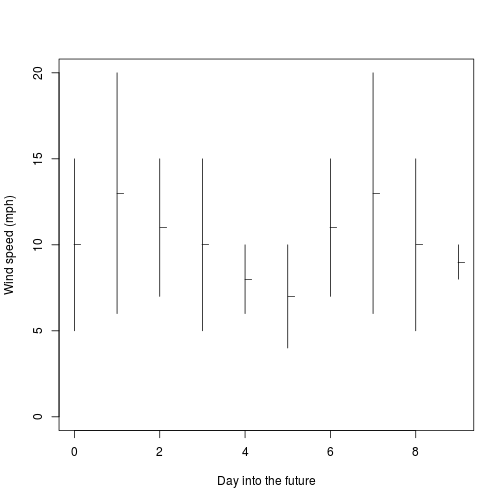
Plotting this table as an OHLC chart is very simple – I’ll just open a blank plot, place my segments on it, then the mean points, and be done:
plot(0,0, type='n', ylim=c(0, max(winds)), xlim=c(0, nrow(winds)-1), xlab='Day into the future', ylab='Wind speed (mph)')
segments(0:(nrow(winds)-1), winds$minwind, 0:(nrow(winds)-1), winds$maxwind)
points(0:(nrow(winds)-1)+0.08, winds$avewind, pch='_')
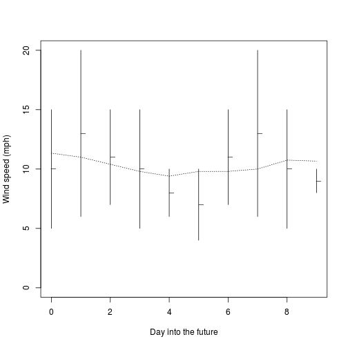
If I want to get fancy, I can write a quick running-average function and draw a line on the plot. Surprisingly, this is not a function in R’s base packages either. Of course, you can get this in many packages if you want to do that instead.
rMu <- function(
    x,        # Vector of values to average
    wl = 3   # Window length: number of frames to average
){
    trail <- wl %/% 2
    lead <- wl %/% 2  - (wl + 1) %% 2 # When wl is even, extra value is behind center
    sapply(1:length(x), function(y) {
        thiswin <- (y-trail):(y+lead)
        vals <- na.omit(x[thiswin[thiswin > 0]])
        sum(vals)/length(vals)
    })
}

plot(0,0, type='n', ylim=c(0, max(winds)), xlim=c(0, nrow(winds)-1), xlab='Day into the future', ylab='Wind speed (mph)')
segments(0:(nrow(winds)-1), winds$minwind, 0:(nrow(winds)-1), winds$maxwind)
points(0:(nrow(winds)-1), winds$avewind, pch='_')
lines(0:(nrow(winds)-1), rMu(winds$avewind, wl=5), lty=3)
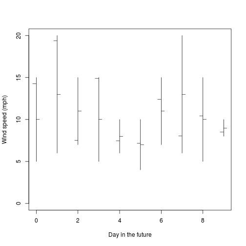
Of course, if you want to split hairs, this chart only shows three values, and an OHLC chart shows 4. You could add a 4th easily by offsetting another set of tickmarks in the other direction.
randval <- unlist(lapply(1:nrow(winds), function(x) runif(1, winds[x,'minwind'], winds[x,'maxwind'])))
plot(0,0, type='n', ylim=c(0, max(winds)), xlim=c(0, nrow(winds)-1), xlab='Day in the future', ylab='Wind speed (mph)')
segments(0:(nrow(winds)-1), winds$minwind, 0:(nrow(winds)-1), winds$maxwind)
points(0:(nrow(winds)-1) - 0.08, randval, pch='_')
points(0:(nrow(winds)-1) + 0.08, winds$avewind, pch='_')