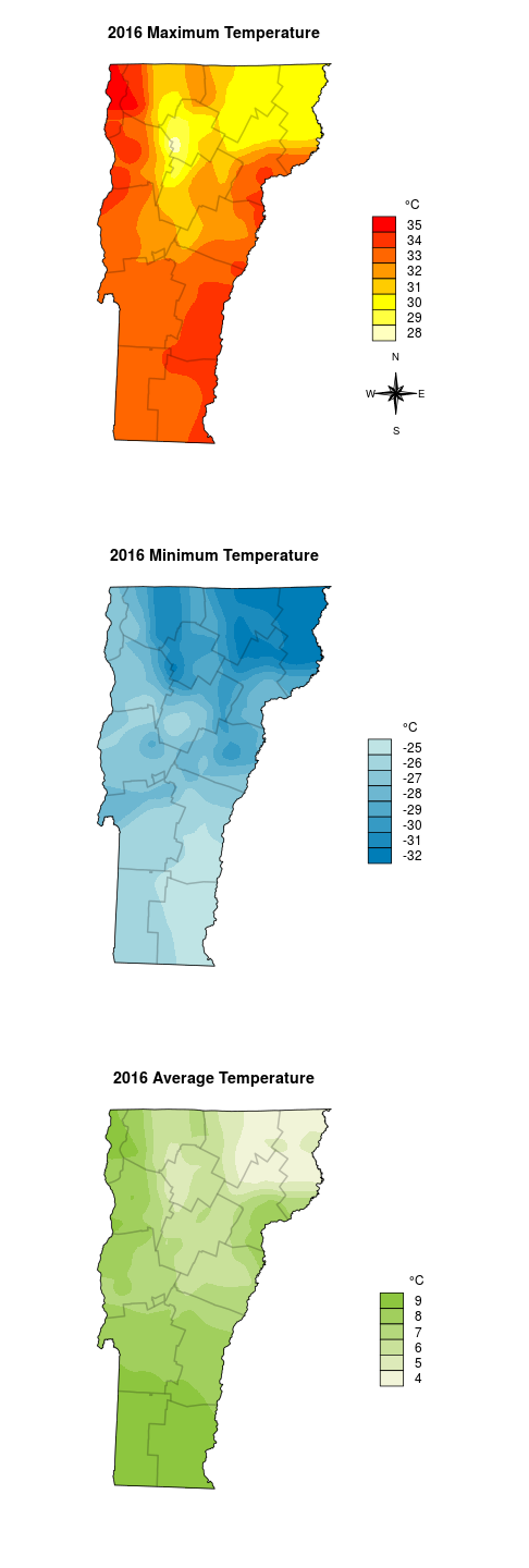
I was recently asked to put together a quick local weather summary for 2016. I’m planning to say a few words about temperature in Vermont, and I have temperatures recorded at about 25 weather stations. It would be easy to present those data points in a table, but a map would be more engaging to the reader. To make a map I’ll need to fill in the space, or interpolate, between the points. This is the map I want to make:
Interpolation can be done by building on the relationship of the target variable to other spatial variables, or it can be done by creating value-gradients between points. We wildlife folk regularly use the MacKenzie-Royle occupancy model structure (see package unmarked) to infer and interpolate species presence/absence based on the relationship a species has to spatial variables, but since temperature probably occurs on a gradient it is not terribly wrong to go this route, and I avoid needing to delve into the rabbit-hole of multiple model inference.
The steps I’ll complete here will be:
- Prepare the temperature data:
* Read in the three tables of temperatures(Min, Max, and Mean) and the station coordinates.
* Merge the four tables by station name. - Prepare the spatial data:
* Convert the x-y table to a ‘shapefile’, or more generically, a sp::SpatialPointsDataFrame object.
* Read in a raster to use for interpolation dimensions.
* Read in a polygon file for boundary and extent dimensions. Transform datum to match the raster. - Interpolate!
- Plot (with base graphics).
I’m getting the data from the NRCC website (). This website doesn’t support html queries, so I had to get the data manually. I grabbed Max, Min, and Average temperatures in three separate downloads.
Getting started: prepare the temperature data
Step one is load the standard spatial data packages. In addition to the packages I’m also going to source in a few of my favorite helper scripts; one that makes a north arrow and another that allows me to customize filled boxes in the legend.
library(sp)
library(rgdal)
library(raster)
library(gstat)
source('mapFunctions.R') # Adapted from from http://www.jstatsoft.org/v19/c01/paper
source('http://www.math.mcmaster.ca/bolker/R/misc/legendx.R')
Next I’ll read in the three tables. Some of the weather stations are missing many days of observations. If a station does not record data for the entire summer, it will appear to be in an exceptionally cold area and will disrupt the results. The opposite appearance will occur if it is missing the entire winter, with the same general effect. I’m arbitrarily setting the cutoff for quality data at a maximum of 14 or fewer missing days per station. Once the unreliable stations are removed, I’ll combine the tables by weather station name and convert all of the Farenheit values to Celsius.
options(stringsAsFactors=FALSE)
ma <- read.csv('data/max.csv')
mi <- read.csv('data/min.csv')
me <- read.csv('data/mean.csv')
# Remove stations with more than 14 missing days
ma <- ma[ma$mcnt <= 14,]
mi <- mi[mi$mcnt <= 14,]
me <- me[me$mcnt <= 14,]
# merge all tables
dat <- merge(ma[1:2], mi[1:2], by='Name', all=TRUE, sort=FALSE)
dat <- merge(dat, me[1:2], by='Name', all=TRUE, sort=FALSE)
names(dat) <- c('Name', 'Max', 'Min', 'Mean')
for(i in 2:4) dat[i] <- (as.numeric(dat[,i])-32) * 5/9
I forgot that I also grabbed the locations separately – but also from the NRCC page. I clicked on the ‘Multi-Station’ tab, then chose ‘Daily Data’ and set ‘State’ to Vermont. I think I manually removed the actual data from this table and left just the station coordinates and elevation, which must be converted to numeric because the ‘Burlington Area’ row contains text rather than location data.
locations <- read.csv('data/locations.csv')
dat <- merge(locations, dat, by='Name', all=TRUE, sort=FALSE)
dat <- na.omit(dat)
# remove 'Burlington Area'
dat <- dat[-which(dat$Name == 'Burlington Area'),]
rownames(dat) <- 1:nrow(dat)
for(i in 2:3) dat[i] <- as.numeric(dat[,i])
dat
##                          Name Longitude Latitude Elevation      Max       Min      Mean
## 1             SAINT JOHNSBURY   -72.019   44.420       700 32.77778 -27.77778  7.888889
## 2                MT MANSFIELD   -72.815   44.525      3950 24.44444 -35.55556  2.944444
## 3                  SOUTH HERO   -73.303   44.626       110 35.00000 -27.22222  9.166667
## 4                  EAST HAVEN   -71.891   44.643      1000 31.66667 -30.55556  4.833333
## 5                 SUTTON 2 NE   -72.023   44.665      1000 30.55556 -31.66667  4.055556
## 6               SOUTH LINCOLN   -72.974   44.073      1341 30.55556 -32.77778  6.166667
## 7                 ISLAND POND   -71.890   44.813      1200 30.00000 -31.66667  5.944444
## 8            ENOSBURG FALLS 2   -72.814   44.910       425 33.33333 -31.11111  7.111111
## 9                      SUTTON   -72.048   44.612      1500 30.00000 -31.66667  5.944444
## 10 MORRISVILLE STOWE STATE AP   -72.614   44.534       732 32.22222 -27.22222  7.166667
## 11          BURLINGTON WSO AP   -73.150   44.468       350 35.55556 -25.00000  9.611111
## 12                 PLAINFIELD   -72.415   44.276       800 32.22222 -30.55556  5.833333
## 13              WORCESTER 2 W   -72.582   44.375      1360 31.66667 -28.88889  7.333333
## 14                  WALDEN 4N   -72.220   44.503      2250 28.88889 -32.77778  4.222222
## 15            WAITSFIELD 2 SE   -72.796   44.176      1142 31.11111 -22.22222  7.055556
## 16               GALLUP MILLS   -71.784   44.578      1319 30.55556 -32.77778  5.500000
## 17                    AVERILL   -71.690   45.006      1699 30.55556 -32.22222  4.722222
## 18             ELMORE VERMONT   -72.529   44.543      1200 31.66667 -29.44444  7.111111
## 19     ESSEX JUNCTION VERMONT   -73.116   44.508       340 35.55556 -26.66667  9.277778
## 20             SWEEZY VERMONT   -73.033   43.333       668 33.33333 -27.22222  9.111111
## 21                JOHNSON 2 N   -72.679   44.658       980 30.55556 -30.00000  6.222222
## 22     BENNINGTON MORSE ST AP   -73.247   42.891       826 33.33333 -27.22222  9.000000
## 23             TOWNSHEND LAKE   -72.700   43.050       510 33.33333 -25.55556  9.111111
## 24         N SPRINGFIELD LAKE   -72.506   43.339       560 33.88889 -26.11111  8.444444
## 25    SPRINGFIELD HARTNESS AP   -72.518   43.344       578 33.88889 -26.11111  8.388889
## 26        NORTH HARTLAND LAKE   -72.362   43.603       570 33.33333 -27.22222  7.666667
## 27                  WOODSTOCK   -72.507   43.630       600 33.88889 -26.11111  8.166667
## 28                    RUTLAND   -72.978   43.625       620 32.22222 -27.22222  7.944444
## 29          UNION VILLAGE DAM   -72.258   43.792       460 34.44444 -26.66667  7.888889
## 30                   CORNWALL   -73.211   43.957       345 35.55556 -27.22222  8.666667
## 31                    CORINTH   -72.319   44.007      1180 31.66667 -31.66667  6.055556
## 32        BARRE MONTPELIER AP   -72.562   44.204      1165 32.22222 -28.33333  6.944444
## 33                 PASSUMPSIC   -72.033   44.367       490 37.77778 -25.55556 11.555556
Prepare the spatial data
When I get Latitude and Longitude points in North America that don’t specify a datum I typically assume they are WGS84 since it is a common default for consumer GPS units, and it is what online services such as Google Maps typically report. Maybe NAD83 is a more reasonable assumption for older points like long-term monitoring stations, but the difference between the two in the horizontal dimension is about 2 meters (on average), so I won’t worry about it here.
spdat <- sp::SpatialPointsDataFrame(
    coords=dat[,c('Longitude','Latitude')],
    data=dat[,c('Name','Elevation','Max','Min','Mean')],
    proj4string = CRS("+init=epsg:4326")
)
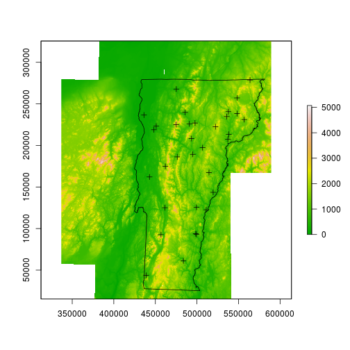
Next I’ll read in a raster that will be used as a scaffold upon which the interpolated values will be stored. The raster contents are not important; I happen to be using the local 1 degree DEM, in which each pixel is roughly 66m by 93m. I’ll also read in a few polygon files – one is the Vermont border, the other contains county boundaries that will be semi-transparent and will offer some local reference.
dem <- raster::raster('data/dem_250/dem_250')
spdat <- sp::spTransform(spdat, CRS(proj4string(dem)))
vt <- rgdal::readOGR(dsn='data/VT', layer='VT_Boundaries__state_polygon')
## OGR data source with driver: ESRI Shapefile
## Source: "data/VT", layer: "VT_Boundaries__state_polygon"
## with 1 features
## It has 3 fields
vt <- sp::spTransform(vt, CRS(proj4string(dem)))
counties <- rgdal::readOGR(dsn='data/BoundaryCounty_CNTYBNDS', layer='Boundary_CNTYBNDS_poly')
## OGR data source with driver: ESRI Shapefile
## Source: "data/BoundaryCounty_CNTYBNDS", layer: "Boundary_CNTYBNDS_poly"
## with 14 features
## It has 4 fields
counties <- sp::spTransform(counties, CRS(proj4string(dem)))
plot(dem, col=terrain.colors(255))
plot(vt, add=TRUE)
plot(spdat, add=TRUE)
Interpolation
I’ll start by interpolating the max temperature data, then later I’ll repeat the exact same steps for min and mean temperature. I’m going to use the gstat package and specify the intercept model. The helpfile for raster::interpolate suggests that I should be using stats::lm since the lat and long are implicit (rather than explicit) components of the model, but that didn’t work for me – and this did.
fitmax <- gstat::gstat(formula = Max ~ 1, data = spdat, nmax = 4, set = list(idp = .5))
maxint <- raster::interpolate(dem, model=fitmax, ext=vt)
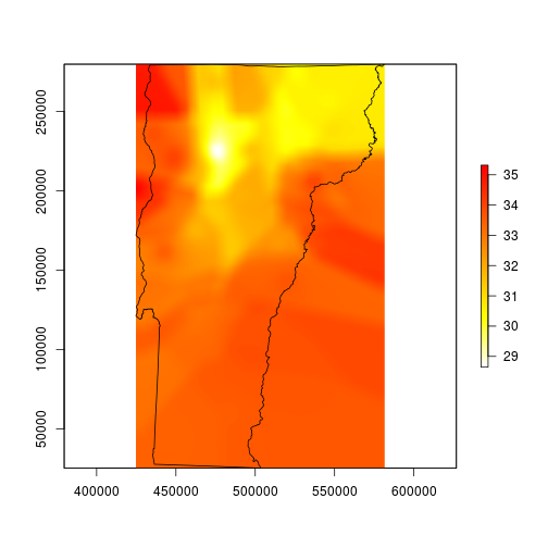
plot(maxint, col=rev(heat.colors(255)), ext=vt)
plot(vt, add=TRUE)
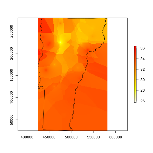
My map now looks like it was made by a cubist robot. This is a good start, but it is far from finished – it needs to be smoothed for better contouring. I’m smoothing it here using what ArcMappers call focal statistics; this means I will use a moving window function that centers over every cell in the raster in succession. The window here is a matrix 101 x 101 pixels (the odd number creates a single center cell), which translates to about 1.26 miles wide and 1.78 miles tall, and the function it applies is an average across the entire matrix.
# smooth with a local average that automatically removes NA values
fmean <- function(x) mean(x, na.rm=TRUE)
# pad allows the function to run all of the way to the edges
vtmaxsm <- raster::focal(maxint, w=matrix(1, 101, 101), fmean, pad=TRUE)
plot(vtmaxsm, col=rev(heat.colors(255)), ext=vt)
plot(vt, add=TRUE)
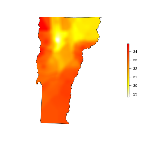
This looks much better, so I’ll mask to the state boundary and go for the finishing touches.
# mask to state boundary
vtmaxsm_m <- raster::mask(vtmaxsm, vt)
plot(vtmaxsm_m, col=rev(heat.colors(255)), ext=vt, box=FALSE, axes=FALSE)
plot(vt, add=TRUE)
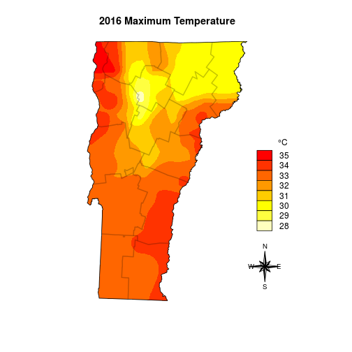
Plotting
Once the data are in place the fun can begin. When working with maps, this is where data analysis becomes cartography. Since much of mapping is based on aesthetic decisions to make the data pleasant to look at and easier to interpret it is tough to automate. At a minimum we need a legend, a north arrow, and a scale bar (I actually don’t plan to put a scale bar on it). After taking a look at the range of temperatures a legend with 1 degree C divisions seems easier to view than one that uses smooth gradients like the prototype maps above.
# determine the range of temps
max_minval <- floor(cellStats(vtmaxsm_m, stat='min'))
max_maxval <- ceiling(cellStats(vtmaxsm_m, stat='max'))
max_temprange <- max_minval:max_maxval
maxcolgrad <- rev(heat.colors(length(max_temprange)))
And the final plot I add the boundaries one at a time so I can better control the border color.
plot(vtmaxsm_m, ext=vt, col=maxcolgrad, axes=FALSE, box=FALSE, legend=FALSE, main='2016 Maximum Temperature')
for(i in 1:nrow(counties)) plot(counties[i,], border=rgb(0,0,0,alpha=0.12), lwd=2, add=TRUE)
plot(vt, add=TRUE)
legend('bottomright', legend=rev(max_temprange), fill=rev(maxcolgrad), bty='n', title=expression(paste("\t   ", degree,"C")),  box.cex=c(2, 1), inset=c(0, .25))
# I set the legend location with a call to locator()
northarrowTanimura(loc=c(599037.5, 58730), size=60000, cex=0.8)
Then I repeat for the min and mean temperatures, and I can plot them all on the same image.
## MIN
fitmin <- gstat(formula = Min ~ 1, data = spdat, nmax = 4, set = list(idp = .5))
minint <- interpolate(dem, model=fitmin, ext=vt)
# smooth with a local average
vtminsm <- focal(minint, w=matrix(1, 101, 101), fmean, pad=TRUE)
# mask to state boundary
vtminsm_m <- mask(vtminsm, vt)
# determine the range of temps
min_minval <- floor(cellStats(vtminsm_m, stat='min'))
min_maxval <- ceiling(cellStats(vtminsm_m, stat='max'))
min_temprange <- min_minval:min_maxval
coolramp <- colorRampPalette(c('#007db7', '#bfe4e5'))
mincolgrad <- coolramp(length(min_temprange))

## MEAN
fitmean <- gstat(formula = Mean ~ 1, data = spdat, nmax = 4, set = list(idp = .5))
meanint <- interpolate(dem, model=fitmean, ext=vt)
# smooth with a local average
vtmeansm <- focal(meanint, w=matrix(1, 101, 101), fmean, pad=TRUE)
# mask to state boundary
vtmeansm_m <- mask(vtmeansm, vt)
# determine the range of temps
mean_minval <- floor(cellStats(vtmeansm_m, stat='min'))
mean_maxval <- ceiling(cellStats(vtmeansm_m, stat='max'))
mean_temprange <- mean_minval:mean_maxval
meanramp <- colorRampPalette(c('#f1f4d8', '#8dc63f'))#008080
meancolgrad <- meanramp(length(mean_temprange))

par(mfrow=c(3,1))
par(mar=c(5.1,0,4.1,0))
plot(vtmaxsm_m, ext=vt, col=maxcolgrad, axes=FALSE, box=FALSE, legend=FALSE, main='2016 Maximum Temperature')
for(i in 1:nrow(counties)) plot(counties[i,], border=rgb(0,0,0,alpha=0.12), lwd=2, add=TRUE)
plot(vt, add=TRUE)
legend('bottomright', legend=rev(max_temprange), fill=rev(maxcolgrad), bty='n', title=expression(paste("\t   ", degree,"C")),  box.cex=c(2, 1), inset=c(0, .25))
northarrowTanimura(loc=c(625000, 58730), size=60000, cex=0.8)


par(mar=c(5.1,0,4.1,0))
plot(vtminsm_m, ext=vt, col=mincolgrad, axes=FALSE, box=FALSE, legend=FALSE, main='2016 Minimum Temperature')
for(i in 1:nrow(counties)) plot(counties[i,], border=rgb(0,0,0,alpha=0.12), lwd=2, add=TRUE)
plot(vt, add=TRUE)
legend('bottomright', legend=rev(min_temprange), fill=rev(mincolgrad), bty='n', title=expression(paste("\t   ", degree, "C")), box.cex=c(2, 1), inset=c(0, .25))

par(mar=c(5.1,0,4.1,0))
plot(vtmeansm_m, ext=vt, col=meancolgrad, axes=FALSE, box=FALSE, legend=FALSE, main='2016 Average Temperature')
for(i in 1:nrow(counties)) plot(counties[i,], border=rgb(0,0,0,alpha=0.12), lwd=2, add=TRUE)
plot(vt, add=TRUE)
legend('bottomright', legend=rev(mean_temprange), fill=rev(meancolgrad), bty='n', title=expression(paste("\t   ", degree, "C")), box.cex=c(2, 1), inset=c(0, .25))